We recently interviewed a number of prominent Bay Area interior designers on their favorite shades of white for painting interiors. In this post, Mead Quin weighs in. (To return to the introduction and access links to other designers' interviews, click here.)

Mead Quin, Emeryville (www.meadquindesign.com) All White by Farrow and Ball, and Simply White by Benjamin Moore
How would you describe your design aesthetic? Beauty Simplified is our brand essence. We believe less is more. We love creating thoughtful, restrained, elegant spaces that are timeless and serene.
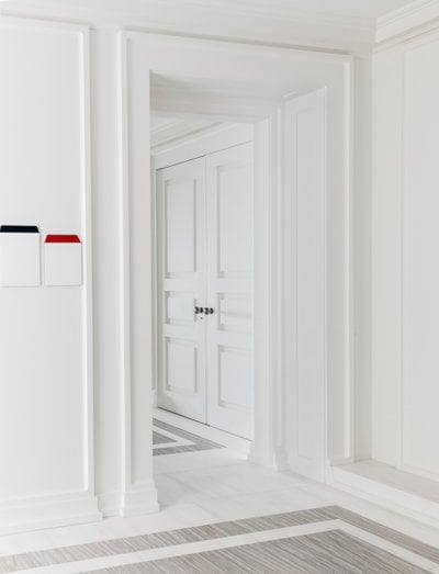
What advice would you give to homeowners about choosing whites? I love white because of its modern, clean and quiet characteristics. For me personally, as a painter, it feels like a beautiful blank canvas to start my work on. A common concern is that white will feel cold and sterile. Thankfully, there are a million shades and our clients trust us to recommend the right one that will keep their home feeling warm and inviting.
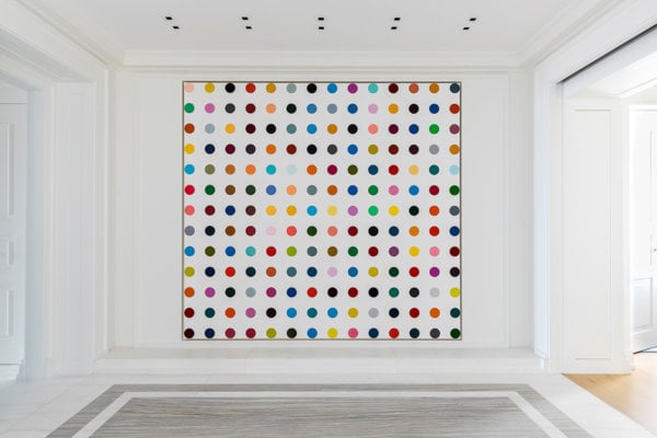
We often select white for clients who collect art. In this circumstance, it is important to find a neutral shade, not too cool or too warm, so that the white walls support the art rather than detract from it. It also supports the home feeling like a welcoming space rather than an art gallery.
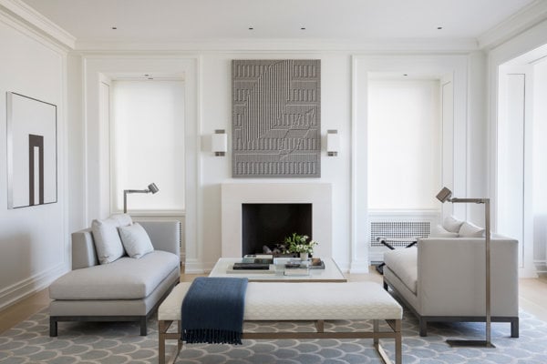
In one of the homes where we are currently working, we just went through the exercise of selecting a neutral, overall color. The house has very high ceilings where one room opens up to the next. While tempted to go with one of our favorites, Benjamin Moore Simply White, we decided to go with a pale taupe/grey, Benjamin Moore Classic Gray, to create a feeling of coziness. The result was perfect. Everything feels fresh and light yet is still warm and inviting.
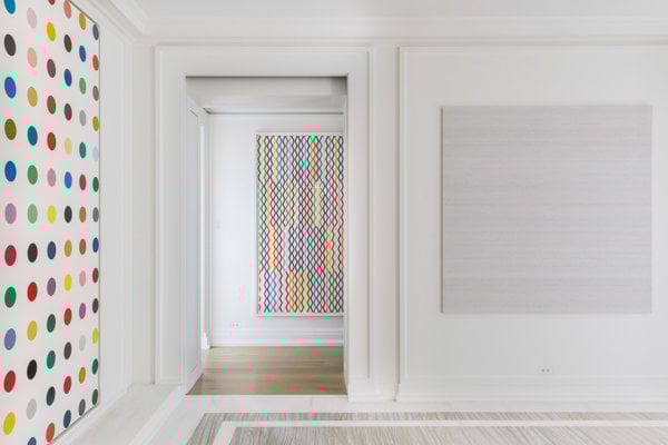
Do you have a project/story that demonstrates an unexpected or particularly spectacular use of white? We recently published a project in Interiors magazine (photos of that project are included in this blog post); the client had an unbelievable collection of art. It was particularly important to find a quiet, neutral white that would feature rather than compete with the art in any way.