


How to Paint Gutters the Right Way: A Bay Area Homeowner’s Honest Look at What Works
Walk around your San Leandro home after a wet winter and you might notice it is finally time to paint your gutters: a chalky finish, faded color, maybe a rust tinge near the seams. If you have been putting it off while wondering how to paint gutters correctly, the short [...]
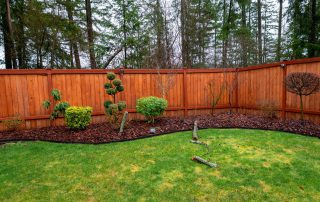
The Best Stain for a Cedar Fence Isn’t One-Size-Fits-All — Here’s How to Decide
Your cedar fence looked warm and rich when it was first installed. Now, a season or two in, you might be watching it fade, that golden honey tone slowly shifting toward silver-gray. A cedar fence in Alameda weathers fast, and if you are standing in your backyard wondering which product [...]

How Much Does It Cost to Paint Kitchen Cabinets in Lafayette?
Discover the true cost to paint kitchen cabinets in Lafayette, CA. Get expert pricing breakdowns, compare DIY vs professional options, and maximize your ROI.
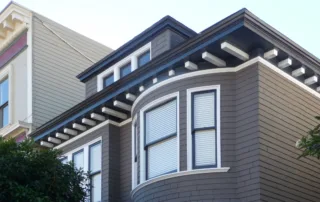
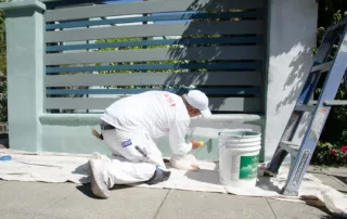
Why Your Exterior Trim Paint Keeps Failing in California’s Coastal Climate
Discover the real causes behind exterior trim paint failures in Alameda's coastal climate and learn professional solutions that actually last. Get expert help today.
Exterior Painting Contractors vs DIY: The True Oakland Cost Math Every Homeowner Needs
Oakland homeowners: Hiring exterior painting contractors vs DIY costs more upfront but saves long-term. Compare real costs, risks, and lead paint requirements.

Best Interior Paint for Durability in Bay Area Homes
Most guides on the best interior paint for durability hand you a product list and move on. They assume standard drywall, a new suburban build, and conditions that describe almost nothing in Oakland, Berkeley, Alameda, or the wider East Bay.The homes here are different. Craftsman bungalows with original 1920s plaster [...]

What Affects Exterior Painting Cost Before You Get a Quote
The quote comes back and the number stops you cold. You were expecting one figure and got something higher, sometimes significantly higher. Before you assume the painter is overcharging, it helps to understand what's actually being priced.Exterior painting cost is not calculated the same way across every home. The variables [...]
Oil vs Latex Exterior Paint: What Bay Area Homes Actually Need
You hired a painter 4 years ago. The work looked great at first. Then the peeling started, right along the window trim, across the south-facing siding, around the front door. By year 5, it looked like the project never happened.Paint failure like that rarely comes down to just 1 thing. [...]

Does Paint Dry Darker Or Lighter? What Most Homeowners Notice After A Fresh Coat
You pick a color. It looks perfect on the paint chip. Then the wall gets painted and suddenly it looks… different.This is one of the most common questions people ask during a painting project: does paint dry darker or lighter?The short answer is that paint usually dries slightly darker than [...]

Sustainable Painting Practices That Make A Real Difference For Homes
Paint protects your home. It also affects the air inside your house and the environment outside of it. That is why more homeowners are paying attention to sustainable painting practices. These methods focus on safer materials, longer-lasting coatings, and smarter ways to handle products like primer, acrylic paint, and [...]


