Experts weigh in on the awkward feeling surrounding 2024’s pick
A tradition since it was first introduced in 1999, Pantone’s announcement of the Color of the Year usually evokes a sense of whimsy and excitement. From their wildly over-embroidered company language in their press materials, to the bold graphics the company chooses to illustrate it, their Color-of-the-Year announcement has always been greeted with a fair amount of joy.
More a harbinger of industrial and fashion design trends, Pantone’s Color of the Year does sometimes seemingly predict or at least influence play in interior design schemes. Last year’s super-fun Viva Magenta was the perfect example of this, showing up as pops of color in some rooms, and whole walls and even ceilings in others. (See our article on this vibrant color pick from last year.)
This year, we aren’t so sure that will happen.
The reveal of “Peach Fuzz,” Pantone’s selection for 2024, has left us queasy and confused, and we are not alone. The New York Times recently published an article about the color, and the expert opinions gathered echoed our immediate reaction.
Discomfort with the name (which is redolent of pre-pubescence) as well as the actual tone (evoking a limited 1970s powder foundation palette matching Caucasian skin that decades of social justice work have forced makeup companies to expand, or the even more limited definition of “flesh” by Crayola) was not unique to us:
“When I think of peach fuzz — and Peach Fuzz — I think of preadolescents,” noted one reviewer… “Does the shade remind anyone else of a complexion? Specifically, a light one? That gave me pause, for a moment. I think about how brands like Fenty Beauty have pushed the cosmetics industry to make shade ranges that include people of color, especially those with dark skin. This color, plus the skin connotation of the ‘Peach Fuzz’ name, hews pretty closely to the shades worn by white people that there are no shortage of,” concluded another.
Additional comments addressed the color’s indistinct, rather fuzzy vibe: “A noncommittal shade. Neither pink nor orange;” “so, 2024: a year not for bold decisions, but for communicating a sort of vague pleasantness;” and “maybe a quiet, neither-here-nor-there color with just a hint of cheekiness (peach emoji, anyone?).”
However, dragging ourselves away from obsessing on what feels like a marketing miss by the industry leader, we can foresee that the color itself might in fact show up in interior designs this year.
The trend seems to have started last year as we personally noticed an increase in designers showcasing rooms with warmer neutrals, layering earthy terra cottas and corals with pale-peach-leaning beiges and highlighting with creams.
In its own way, Benjamin Moore seems to be on top of the pro-peach-slash-warm-neutrals trend with one of its palettes for 2024:

And yet, note that the top color BM proclaims for the year is “Blue Nova.”
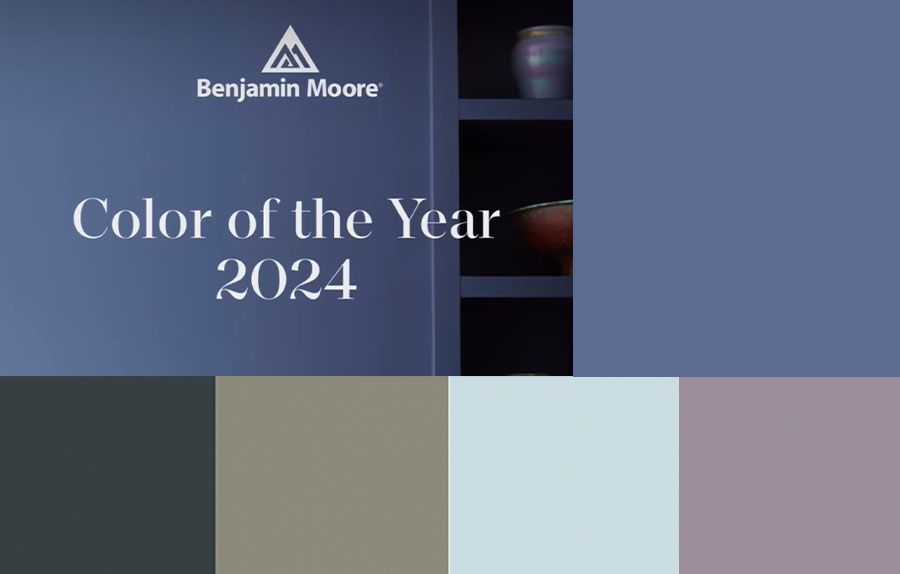
Followers of our blog and newsletter for years — or fans of Benjamin Moore — know that the paint company always covers its bases with multiple palette options each January (see our color of the year report for 2023, also located on the “Resources” page of our website) — and these are usually tangential or entirely unconnected to Pantone’s prognostications.
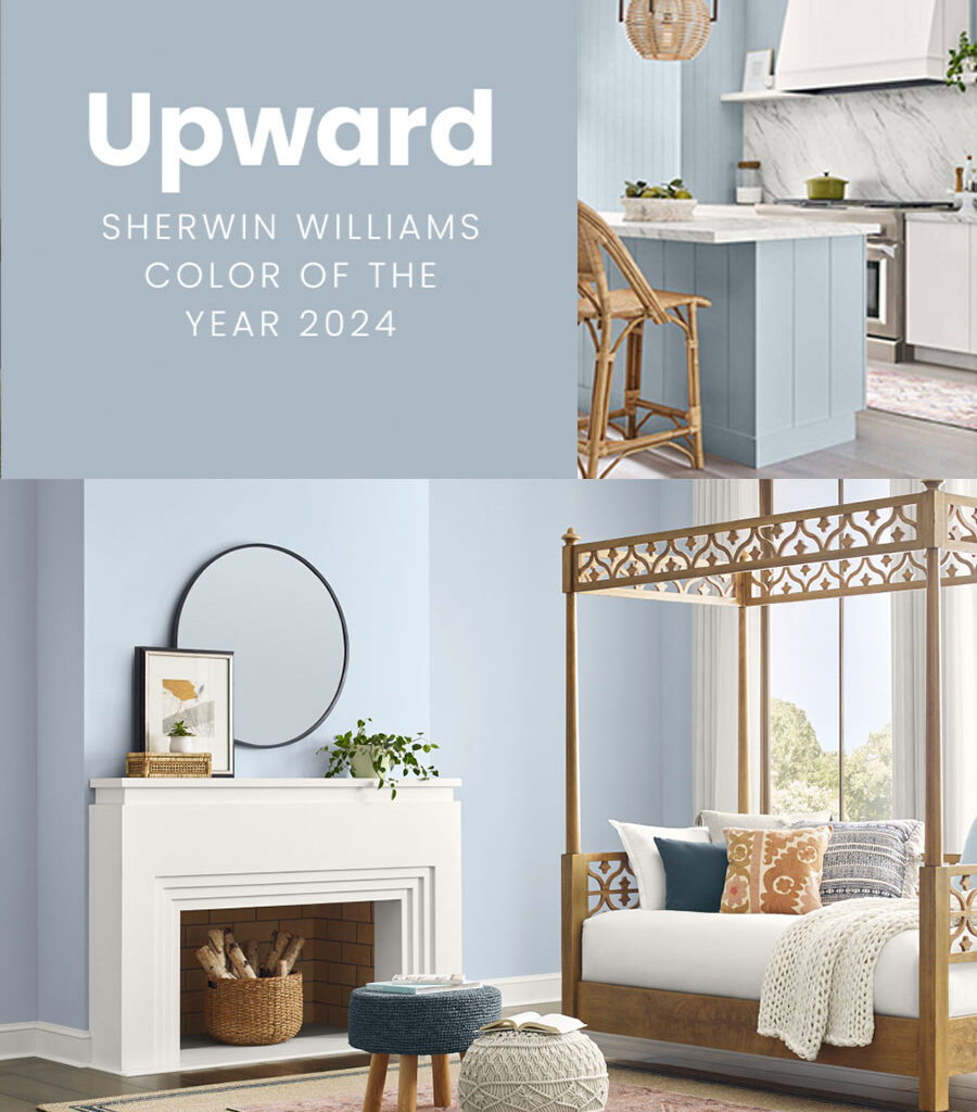
For 2024, Sherwin Williams put forward what the company deems “a breezy, blissful blue,” they call “Upward.”
While we love the sentiments they claim it inspires, “brimming with positive energy, creative thinking, and total contentment,” we’re not sure this color is that. It feels a bit gray to us. Not a bad color at all. Certainly a lovely pale, cool blue. But not quite what we would call “a sunny-day shade.”
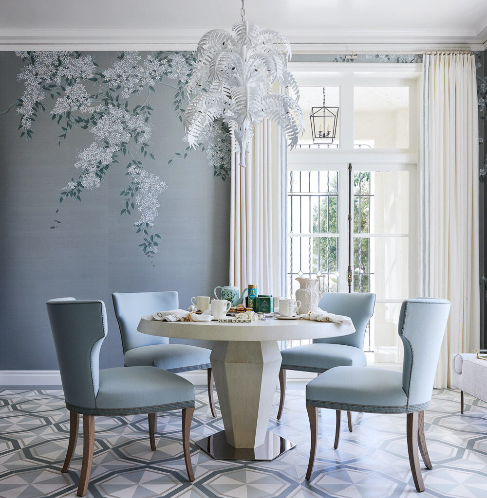
Still, it is a beautiful blue, and not unlike the tones Dina Bandman’s winning design reflected, in her sunroom/breakfast room en français for the 2023 San Francisco Decorator Showcase house, a vision we helped manifest: