


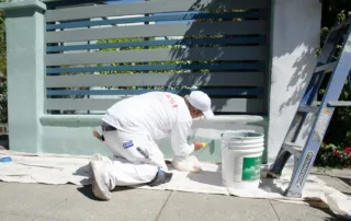
What Affects Exterior Painting Cost Before You Get a Quote
The quote comes back and the number stops you cold. You were expecting one figure and got something higher, sometimes significantly higher. Before you assume the painter is overcharging, it helps to understand what's actually being priced.Exterior painting cost is not calculated the same way across every home. The variables [...]
Oil vs Latex Exterior Paint: What Bay Area Homes Actually Need
You hired a painter 4 years ago. The work looked great at first. Then the peeling started, right along the window trim, across the south-facing siding, around the front door. By year 5, it looked like the project never happened.Paint failure like that rarely comes down to just 1 thing. [...]
Does Paint Dry Darker Or Lighter? What Most Homeowners Notice After A Fresh Coat
You pick a color. It looks perfect on the paint chip. Then the wall gets painted and suddenly it looks… different.This is one of the most common questions people ask during a painting project: does paint dry darker or lighter?The short answer is that paint usually dries slightly darker than [...]

Sustainable Painting Practices That Make A Real Difference For Homes
Paint protects your home. It also affects the air inside your house and the environment outside of it. That is why more homeowners are paying attention to sustainable painting practices. These methods focus on safer materials, longer-lasting coatings, and smarter ways to handle products like primer, acrylic paint, and [...]

How To Make Exterior Paint Last Longer Under California’s Intense Sun
Your home in Lafayette, CA, costs you more than just money. It took years of saving, months of searching, and the kind of commitment that only first-time homeowners understand. So when you notice the exterior paint starting to fade, chalk, or crack after just a few years, it stings. [...]

The 2026 Color of the Year Has Arrived And It’s Perfect for Alameda’s Homes
There's a reason you've been hesitating on that interior house painting project. Choosing a color that feels right in a Victorian, Craftsman, or mid-century home isn't as simple as grabbing whatever's trending. The wrong shade can clash with your home's character, while the right one can make every original [...]

Stop! 10 Things You Should Never Paint Indoors During Your Next Project
Not every surface in your home should get a fresh coat of paint. If you're planning an interior house painting project in Berkeley, knowing what not to paint in your house can save you time, money, and a lot of frustration. There are several things you should never paint [...]
What Is the Best Time of Day to Paint? Timing Tips That Make a Difference
You've picked your colors, bought the supplies, and cleared the room. But before you pop open that paint can, there's one question that could make or break your results: when is the best time of day to paint? If you're planning interior house painting in your Oakland home, timing [...]
5 Signs Your Oakland Home Needs Interior Residential Painting
Winter takes a toll on interior spaces, and spring interior residential painting in Oakland, CA becomes essential when walls show wear from holiday gatherings and daily life. This prepares your home for the competitive real estate market or simply refreshes spaces after months of indoor living. Recognizing the signs that [...]
Exterior Residential Painting for Your Oakland, CA Home After Winter Damage
Winter weather in Oakland takes a toll on exterior surfaces. Spring exterior residential painting in Oakland becomes essential when you notice peeling paint, cracked siding, or moisture damage after months of fog and rain. Spring exterior painting protects your investment and restores curb appeal before minor issues become expensive problems. [...]


