While some might be thinking that we are jumping the gun a little, others feel the same way, 2020 can be over. There isn't a guarantee that a new year means the place gets back to normal, however, there is hope. While many of us spent most of our time at home in 2020, we probably have noticed that our interiors are getting a little outdated. Perhaps you need to freshen up the paint a little. If we are going to be spending more time at home, then shouldn't we be enjoying it? Let's make the inside of your home beautiful. Warm calming pastels along with cheerful and bright colors. After all, we could all use a little cheer after this year!
2020 wasn't all bad, well, it was mostly, but think about the hobbies that you picked back up. Or the extra time you got to spend with your family, the good times. Many of us got to get back to nature and enjoy the outdoors more, since, well, that was pretty much the only place we were allowed to go. During this time vacations were canceled and many of us started investing in the beauty of our own homes. We were busy creating beautiful art for the walls and designing that new garden.
As 2021 rolls in, many fashion designers are thinking that the colors for the year are going to be back to nature with a pop of bright. Let's take a look at what we mean by that.
The colors of 2021
Brave Ground is a dulux color that some of the design experts have chosen as one of the more popular colors of 2021. This warm and earthy tone brings in nature to the interior. It provides a firm foundation for creativity and change. The color represents growth, stability, and potential. This color can be easily combined with other colors in all kinds of ways.
Forecast is another potentially popular color palette for 2021. This color palette offers a sense of comfort and familiarity. These color choices offer a reset, retreat, and nourish. While holding onto a sense of nostalgia, this color palette offers rejuvenating and aesthetic pleasing hues. As life in 2020 may seem a little slower, we like to think that these colors can be a way to bring in the cheer.
The rest palette is a palette that is a little more upbeat. This is sure to bring some cheer into your home. Why not brighten your tone and outlook with some of these bolder tones. While this palette is of brighter tones, it also has a sense of the 70s. This nostalgic look is something that seems to be getting more popular in recent years.
The palette Nourish demands attention and offers a send of unplugging and being in the present moment. This palette is said to offer some rejuvenation of your soul. While it does lean to the more nurturing side, the colors of this palette are warm earth tones such as browns, greens, and yellows. This is an excellent palette choice if you need a sense of warmth and acceptance. It offers a sense of softness that allows your furniture and home decor to meld. Admire your tranquil surroundings with the Nourish palette.
More 2021 Paint Color Choices.
The retreat palette is a mixture of security with a side of comfort. Your home is your central hub for just about anything these days. Many of us are finding that it is where we rest our heads but also where we eat, workout, and even work. We are spending more time in our homes than ever before, so it is important that we are comfortable. The retreat color palette is made to offer this level of comfort. The hues of this palette are very earth tones with browns, blues, and dark greens. While our lives start to be more around your home, you find yourself having to blur the lines of work, relaxation, and play. This is the color palette for you.
Jotun Lady
Jotun Lady is a paint company out of Norway. They have come up with a four color palette collection that is called Rediscover. Rediscover is about finding new ways to play with the different color options and combing in colors in ways you never thought possible.
Warm and rustic colors are what you'll find in the first color palette. In this palette think about the Moroccan desert sand that is rich with golden pinks or the burnt oranges that we think of than we think of Mexico. This is to incorporate the love of culture from around the world. These are really rich and warm color tones. The pinks, orange, and tans are colors that are warm and inviting.
Soft and Neutral colors
The soft and neutral colors are gray, light tan, and light browns. This palette is timeless hues that go with all kinds of different pallets.
Dreamy Pastel Hues
This palette is meant to bring Scandinavian village into your home. This color palette is very warm and earthy. These are fun and light color options that can really brighten up your home and make it quite beautiful.
Airy Blue Tones
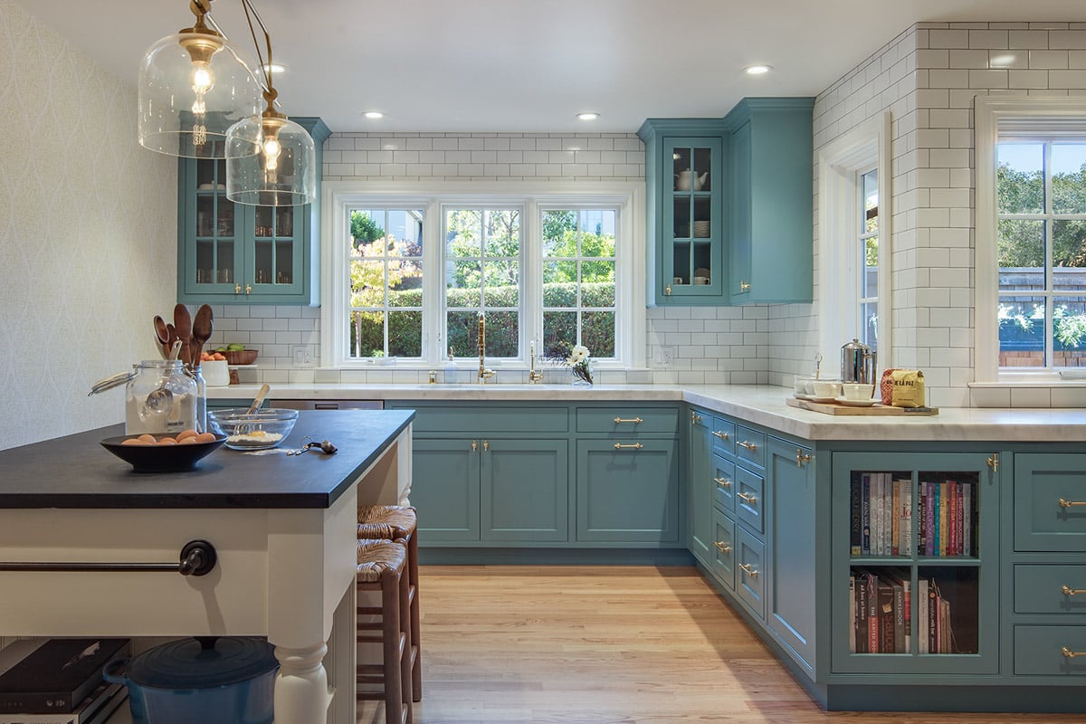
The airy blue tones make your home fun and airy. It is very peaceful and offers a great sense of peace. This color palette is a wonderful way to surround yourself with calm colors and enjoy the cozy environment. Making a cozy environment that allows you to recharge your batteries. These blue-grey hues are perfect for those places that you want rest and comfort in. Places such as the bedroom or living room. This brings in the quiet tranquility of these colors found in nature.
Urbane Bronze is Sherwin-Williams color of 2021
While we have some various color palettes mentioned. We wanted to also take a look at what Sherwin-Willams chose for their color choice of 2021. While we are all stuck inside, it is important to remember that you don't have to look at drab walls. You can have fun with your interior, afterall, you are staring at it more than normal. This Urbane Bronze is a nice warm color that brings a bit of cheer into a drab world.
Behr Color Trends of 2021
Behr, another leader in interior paint also has their palette for 2021 that are divided in 6 color themes. Casual comfort is beautiful light colors and a calm zone are another color choice. These beautiful greens and blues are in the clam zone. Subtle Focus is another group of colors that Behr recommends that is very sophisticated. In the Quiet Haven collect they offer a peaceful oasis with deep hues. Optimistic view is a wonderful collection that is a pop of bright color.