We don’t want to brag, but you can show us any kitchen, and we can assume, in a few years or so, when it was designed or revamped (we know it’s a neat party trick)—because kitchen architecture, like fashion and another home decor, usually follows patterns that come and go.
One minute of avocado-green refrigerators are great, and the next, they’re painfully old. Ditto: flooring of linoleum. We could still say the same thing about cane furniture— only that it came and disappeared, gone, and coming back later.
Many reasons make a kitchen design unwanted and lose the appeal it had on people. One of the reasons is that many modern designs are coming up, thus phasing out traditional kitchen trends that have been there before.
However, some of the old kitchen trends like the use of wood counter tops are slowly coming back and are replacing modern kitchen trends. With the onset of 2020, we figured we’d take a look at a couple of past-their-prime types that are ready to retire, at least until the pattern inevitably comes back.
Let’s clarify — we’re thinking about the real stone, not the feel of marble. With its distinctive striations and shading, it will always look good in the kitchen or the bathroom. Correct marble counter tops, however, come up with a lot of things.
These need to be resealed every few years; these will scrape, rub, or stain; and they are brittle, so that heat and even some chemicals become troublesome if misused. What is the explanation for the exit? There are more robust options available— such as marble, butcher- stone, or even granite.
Marble is expensive to purchase and also will take a toll on your pocket, installing it on your kitchen wall, counter top, or even on the floor. That alone may make a homeowner opt for cheap alternatives to use in their kitchen.
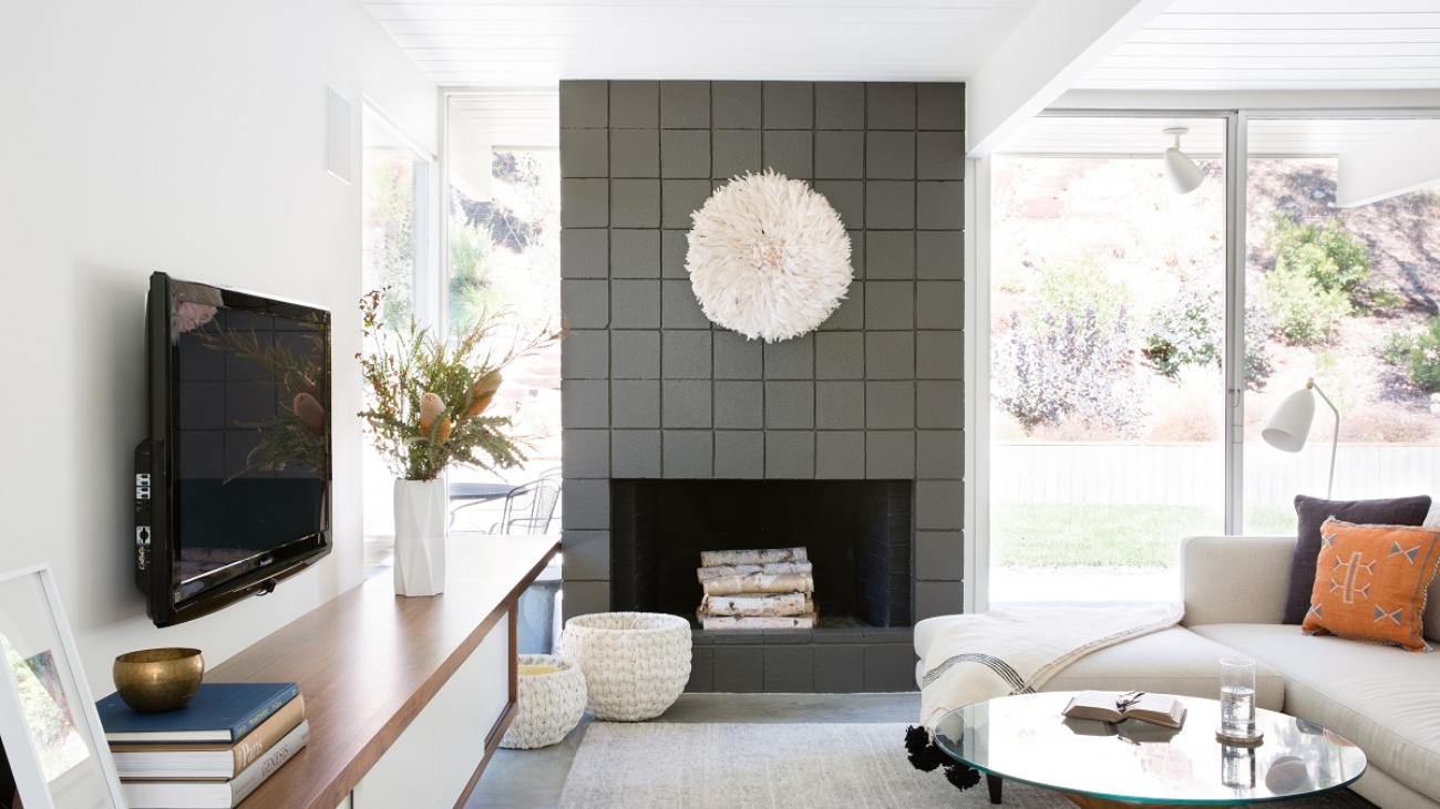
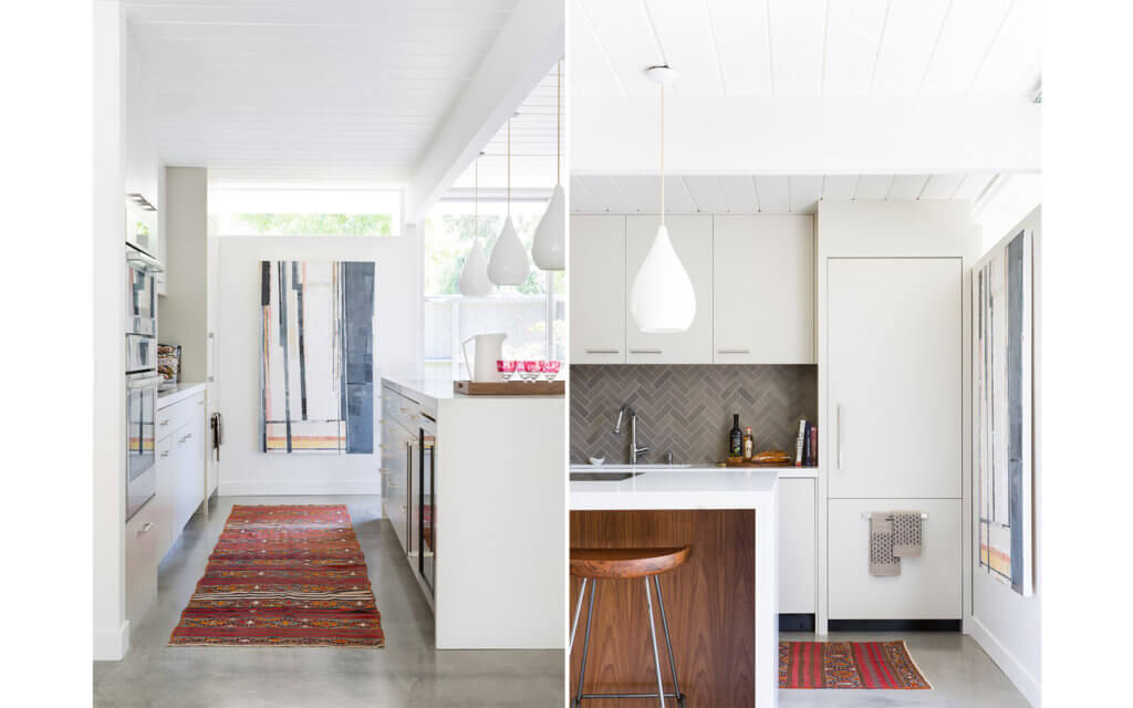
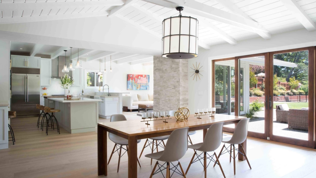
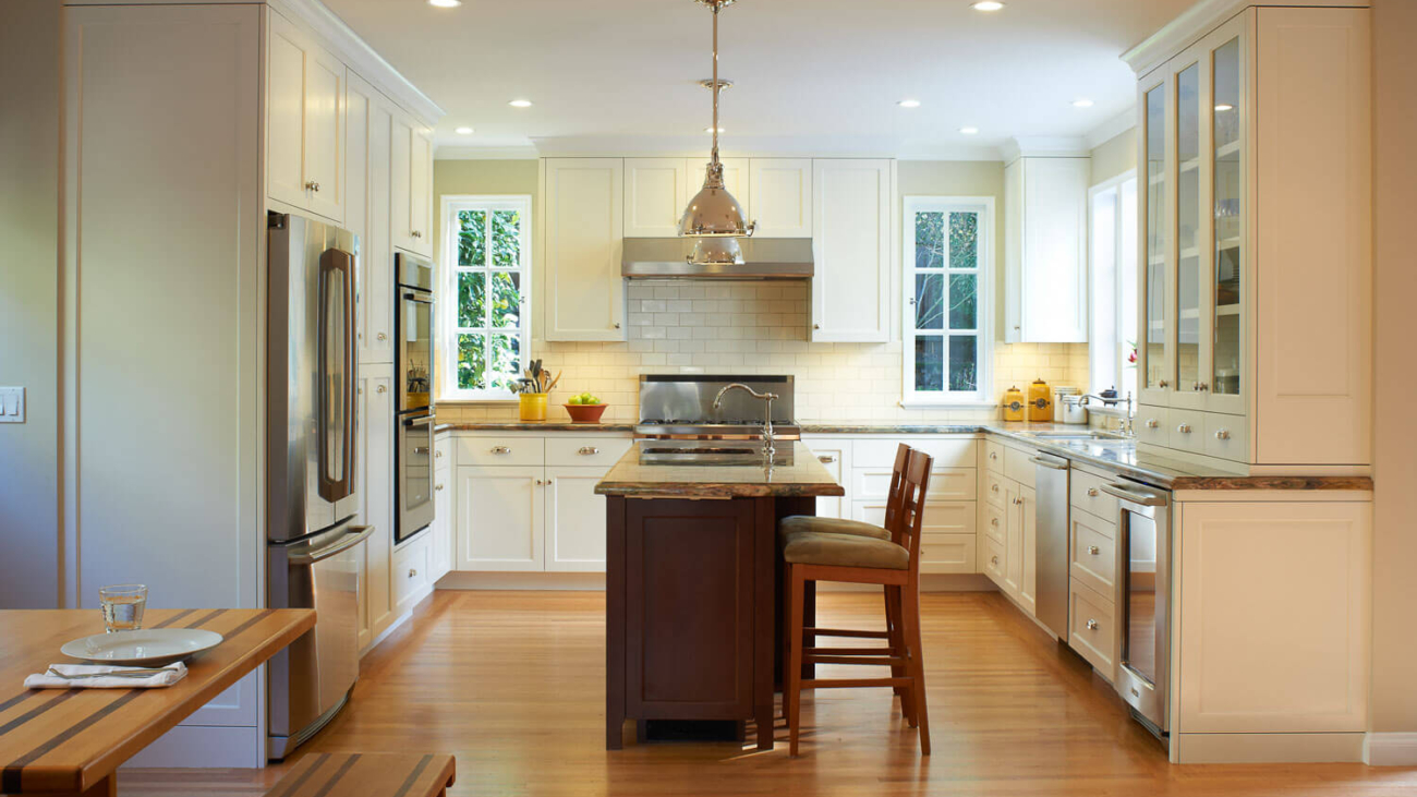
All-White Kitchens
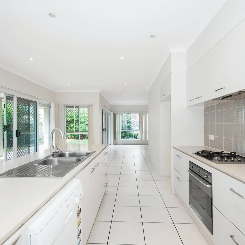
You can’t really go wrong with a white kitchen, but it’s bland, and the design world is over. Where’s the personality? The all-white kitchen has become synonymous in many homes and hotels. It is good to show class in your kitchen and even at the entire house.
However, this trend should not be with us in 2020, moving forward. The main reason is that it does not incorporate any creativity in it. Most all white kitchen are monotonous and do not have any sense of style in them.
With the onset of modern kitchen interior designs, many people opt to use warm colors in their kitchen. This is because warm colors are suitable for appetite and also have an artistic look.
Subway Tiles
There’s nothing objectionable about the subway tiles— it’s just that they’ve been so overdone that they’ve refurbished the bathroom, and they just look like overkill.
There are many other fun ways to make a back splash. Why not try a different form, a handmade tile, or even a stone slab instead?
Industrial-Style Statement Lighting
Heavy, bulky pendant lighting had a moment, but the industrial style had come and gone in favor of something a little lighter and more understated. The new method lets the rest of the kitchen shine and doesn’t block the view in the open concept room.
- Tip: Make sure you always pay attention to the height of your lighting as applied to your floors, cabinets, or kitchen- island.
Plaster Walls
They’ve been all over our Instagram for the last few years. Don’t give in, man. It’s hard to imagine, but the wall plaster would look incredibly old quite early. Oh, it’s a hassle to keep clean, and it can smear quickly. Not perfect for a room where stuff will sometimes spill or splatter.
Barn Doors
They were probably on their way out a couple of years ago — and now they’re legal. They’re just too overdone, and only really make sense in a minimal type of home.
Open Shelving
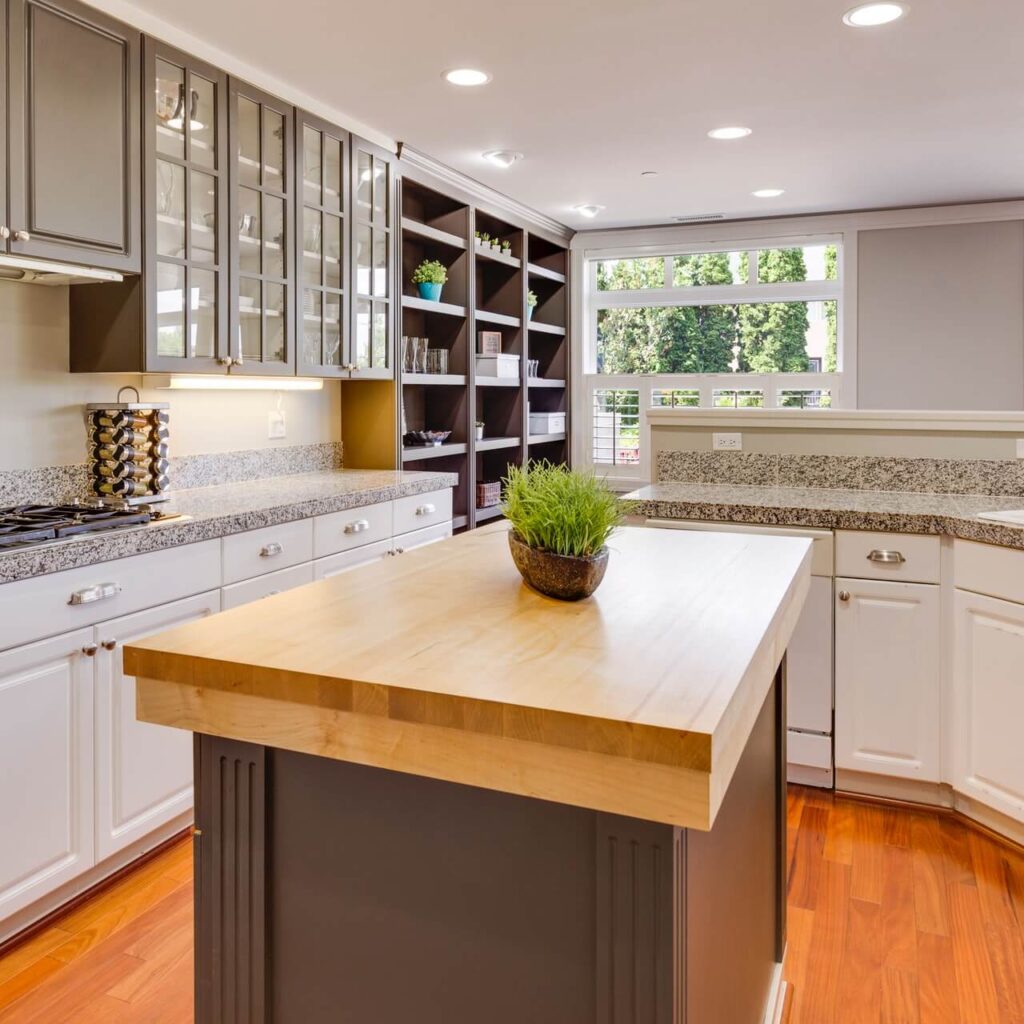
In this day and age, using open shelving as a style in your kitchen may seem outdated. As the days progress, many people are adopting the use of closed shelving in their kitchens.
Open shelving is being phased out with modern home designs. The main reason for this is the open shelving design looks ugly and may create an eyesore to anyone looking at the content on the shelves.
Open- space kitchen
We used to design a kitchen with open space and no doors to increase the space around and also enhance movement in the kitchen. Today, we see the folly in our ways, and we want our walls back.
People were tired of staring at mountains of dirty dishes while they were sitting on the couch, or putting their heads on tossing pillows that feel like dinner last night.
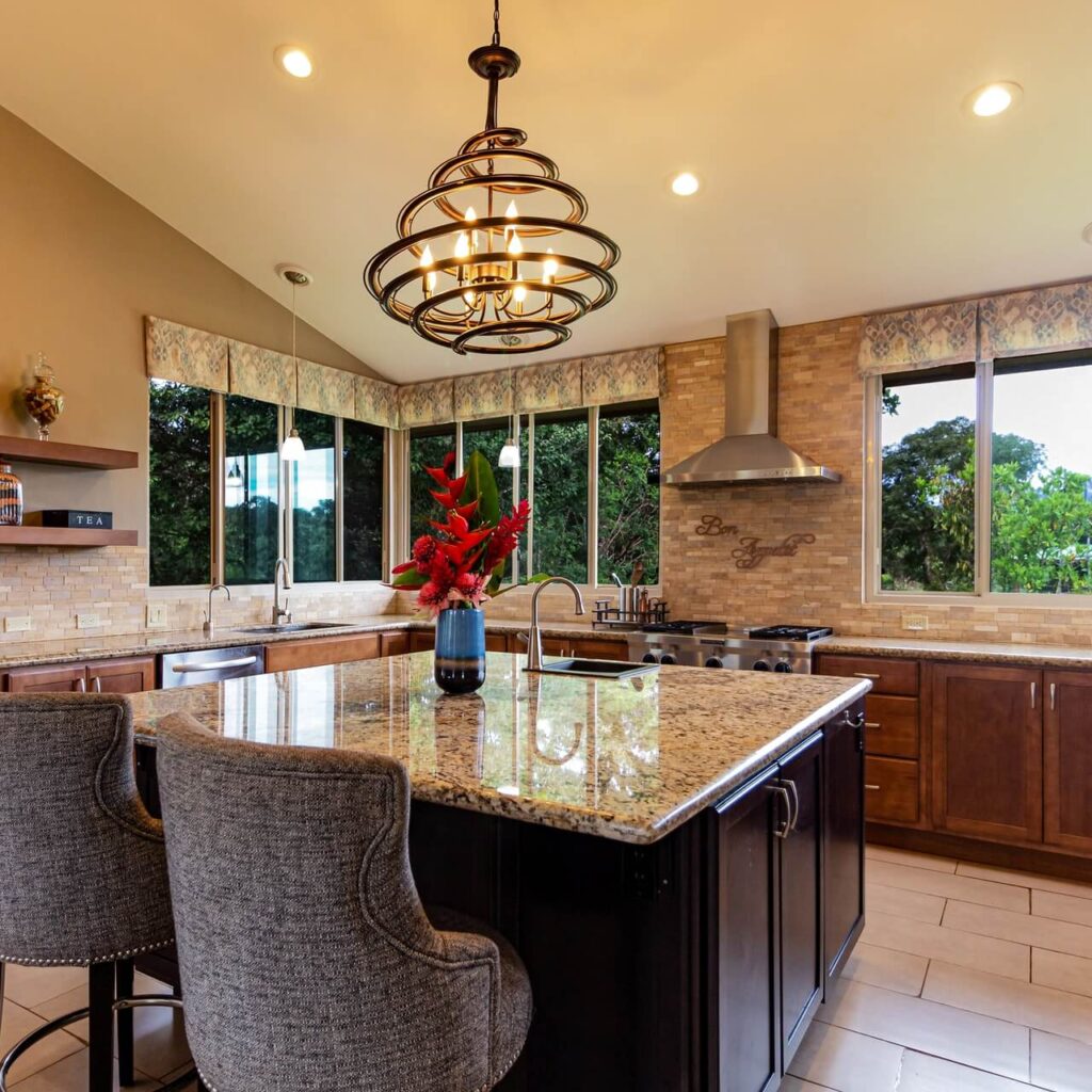
Granite Themed Counter Tops
For many years, granite has been used as the most preferred material for counter tops. Most modern-day designers discourage the use of granite counter tops. As time progress, the trend is slowly fading away, and most people are adopting other styles of designing their counter tops.
Most people are opting to use stone, timber, and concrete as the preferred material for counter tops. White quartz will have a fantastic look if it is used as the primary material for your counter top.
Closed-off kitchens
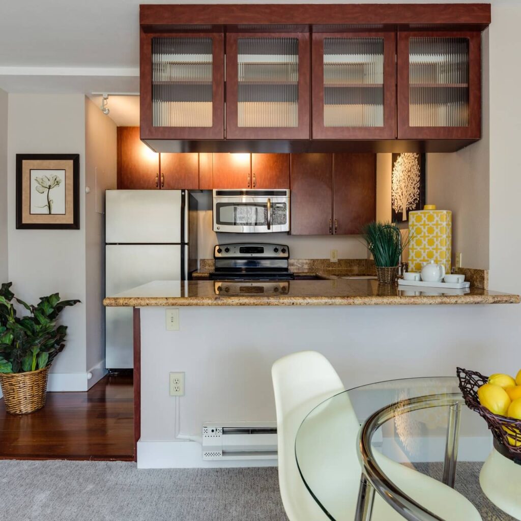
Just like the rest of the house, Quirk notes, the floor plans are available, and they’re here to live.
You may not always want to see the chaos that can build up in the kitchen, but it doesn’t suit modern tastes anyway. Most people refer to open floor kitchens as “Kitchens without Borders.”
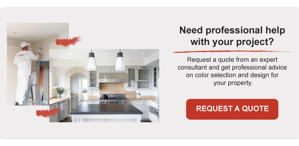
Conclusion
The architecture of your kitchen is one of the most important choices you need to make while decorating your house. The reason is simple: you can’t change the look of your kitchen as quickly as the equipment needs installation and plumbing. Right now, the usual thing is to create a modern kitchen that’s specially built.
If you haven’t yet settled on the most suitable type of decoration for your kitchen, this article will be helpful for you to know kitchen- designs to avoid. We encourage you to apply multiple models for you to have a kitchen that has been modernized and has your personal touch.