
Carolyn Rebuffel Flannery, Workroom C (https://workroomc.com/): Benjamin Moore: Super White, Linen White, White Dove, Decorator’s White
How would you describe your design aesthetic? Home as a haven; peace, simplicity and beauty that resonates with each client’s lifestyle. We strive to craft designs that are inspired, savvy, and practical, and that promote a sense of calm and comfort. We specialize in designing homes for busy families looking for a soothing retreat to call their own.
What advice would you give to homeowners about choosing whites? My top four faves and why: Super White — when there is tons of light; Linen White — super-complimentary in traditional settings and works well with antiques; White Dove — softer than Super White and friendly to other colors; and Decorator’s White — works almost all of the time, in all different lighting conditions.
We put together a blog post listing our top 10 favorite whites, along with a short description of each one’s color undertones, with links to each on the Benjamin Moore website.
Do you have a project/story that demonstrates an unexpected or particularly spectacular use of white? I did have one project where we tried about 15 different whites and ended up using two of the fifteen. That was a crazy project…!
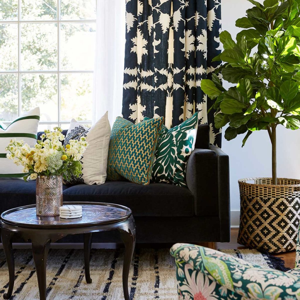
Recently, I moved into a new house, and I realized that this is the third time that I’ve moved into a new house and painted the whole entire interior white! For me, personally, painting the entire house white gives me the perfect jumping off point for art and pattern play, and layering all of that together. My first two homes were very traditional. One house had been built in 1912, the other was a Spanish Mediterranean.
In both of those, Linen White worked all the way through. Linen white is a softer, more traditional white. The house I just moved into is darker, so I’m using White Dove, which brightens it up.
For clients, if I can talk them into being bolder with fabrics and cabinet color choices, then I like white because it’s a great backdrop. But, if I specify a sofa in a very snazzy fabric, that tends to make people more nervous than if I paint their wall a bold color.
Still, I’d rather do a snazzy sofa, patterned pillows, patterned drapes — big, little, and medium patterns and pillow sizes, and paint the walls white. As a designer, you always make your boldest suggestion first, and then you adjust. In theory, white doesn’t really seem like it would be a bold suggestion, but it is.