Bedroom-DSC_8658

How to Maintain Your Painted Surfaces: Tips for Longevity by Arana Craftsman Painters

Because you interior and exterior painted surfaces are more than just decorative we understand that the struggle is real to maintain their longevity. After all, you need your paint job to perform like an investment given how important it is and how much money is spent on them. To help ensure your painted elements maintain their vibrant finish and integrity over the years, we offer the following strategies for preserving these surfaces over time:

Routine Cleaning to Preserve Surface Beauty

One of the most essential steps in maintaining your paint job is regular cleaning. Dirt, dust, grime, and pollutants settle on painted surfaces daily, especially on exterior walls and high-touch interior areas and start to eat away at them.

Interior Surfaces

  • First and foremost – USE THE RIGHT SHEEN ON THE RIGH SURFACE UNDER THE RIGHT CONDITION. For instance, if you have kids and dogs, do not use flat on your hallway walls. Use Eggshell. Paint wood trim with Semigloss. Satin is just not good enough.
  • Dust and Wipe Weekly: Use a soft microfiber cloth or dry duster to gently wipe painted walls. For flat and matte finishes, avoid excessive pressure.
  • Spot Clean Smudges: For stains, use a mild dish soap and warm water mixture. Apply with a soft sponge, then blot dry with a clean towel. On a matte sheen or higher, you can use the magic eraser.
  • Avoid Abrasives: Harsh scrubbers, bleach, or ammonia-based products can erode the paint layer, causing discoloration and surface damage.

Exterior Surfaces

  • Annual Wash-Down: Use a garden hose or low-pressure washer to rinse dirt and mildew from exterior walls. Mix gentle detergent and water for persistent spots.
  • Brush Mold Away: Use a long-handled soft-bristle brush for areas prone to mildew or algae growth, especially on shaded or damp walls.
  • Inspect After Storms: Clean gutters and wash away storm debris promptly to avoid permanent staining or paint erosion.

Inspect and Touch Up Regularly – Especially problem areas

Consistent inspections are vital to identify issues before they worsen. Paint isn’t just for looks—it protects surfaces from moisture, UV damage, and wear.

What to Look For

  • Chalking: A powdery residue on painted exteriors indicates oxidation and UV damage. Wash gently and plan for repainting soon.
  • Delaminating Stucco
  • Cracking or Peeling in the paint film: These are signs of aging, poor surface prep, or moisture problems. Scrape loose areas and apply touch-up paint promptly. Don’t allow cracks in your stucco to go un-addressed for very long. If the stucco is separating from the wood trim make sure to seal that up as quickly as possible. Water can enter these areas undetected and interior wood can rot causing expensive repairs.
  • Blistering: This points to trapped moisture or heat. Address underlying moisture issues before repainting to avoid recurrence.
  • Fading: UV rays can dull vibrant colors, particularly dark hues. Consider UV-resistant coatings during the next repaint. Avoid dark colors as they fade and fail quicker.

Touch-Up Techniques

  • Make sure your leftover paint is stored in sealed containers and labeled by room name, surface, color name and code, and the date.
  • Flat can be touched up if you use a high quality paint. Matte, Eggshell, Satin and Semi-gloss cannot be touched up.
  • If you aren’t super picky, you can feather the edges of touch-ups using a high-quality brush or foam roller to prevent noticeable lines.

Control Moisture to Prevent Paint Degradation

Standing moisture is the silent destroyer of painted surfaces. Both interior and exterior paint suffer under prolonged exposure to humidity, leaks, or poor ventilation.

Interior Moisture Control

  • Use Exhaust Fans: In kitchens, bathrooms, and laundry rooms, run fans during and after use to disperse moisture.
  • Fix Leaks Promptly: Any sign of water stains, bubbling, or musty smells should be traced to a plumbing or structural leak and addressed immediately.
  • Invest in Dehumidifiers: In damp climates or basements, use dehumidifiers to maintain safe humidity levels (between 30-50%).

Exterior Moisture Control

  • Keep Gutters Clean: Overflowing gutters allow water to trickle down painted siding, causing premature peeling.
  • Seal Gaps and Cracks: Use high-grade caulk around windows, doors, and siding to prevent water intrusion.
  • Grade Landscaping Properly: Ensure the ground slopes away from the home’s foundation to reduce splash-back onto painted surfaces.
  • Install proper drainage around your home to move water away.

Protect High-Traffic Areas with Durable Finishes

Not all paints are created equal. For hallways, staircases, baseboards, and other high-contact zones, durable, high-quality and washable sheens are critical.

Recommended Sheens

  • Satin or Eggshell: Ideal for living rooms and hallways—easy to clean and can be resistant to minor scuffs depending on the inhabitants.
  • Semi-Gloss or Gloss: Best for trim, doors, kitchens, and bathrooms due to superior moisture resistance and cleanability.

Preventing Damage

  • Add chair rails or wall guards in narrow hallways or children’s rooms.
  • Use felt pads on furniture to prevent scuffing painted baseboards.
  • Establish regular cleaning routines to prevent buildup of oils, fingerprints, and grime.

Use Quality Materials for Long-Term Results

High-quality primers, paints, and application tools are an absolute must and will significantly extend the life and durability of the surface.

Why Quality Matters

  • Premium paints contain higher quality raw materials, superior formulations with better pigments and binders and other ingredients. This leads to longer-lasting, more vibrant color retention.
  • Top-tier primers ensure optimal adhesion, seal porous surfaces, protect wood and ensure adhesion.
  • Professional-grade equipment, brushes and rollers help to apply paint more evenly and efficiently, reducing streaks and ensuring consistent coverage.

Our Recommendations

  • For interiors, use at least a matte sheen on high traffic walls, use paint from trusted brands like Benjamin Moore, Sherwin-Williams, or Farrow & Ball.
  • For exteriors, a good quality latex with a light color choice will ensure a longer lasting finish.
  • Always apply at the recommended temperature and humidity levels to ensure proper curing.

Schedule Routine Repainting Intervals

Even with diligent maintenance, painted surfaces will eventually need to be refreshed. Repainting not only renews aesthetic appeal but also reinforces the protective barrier.

Average Lifespan of Painted Surfaces

  • Interior Walls: 5–7 years (more frequent for high-traffic rooms)
  • Ceilings: 10+ years unless exposed to smoke or moisture
  • Exterior Siding: 5–10 years depending on climate and paint quality
  • Wood Trim: 3–5 years due to exposure and expansion/contraction

Planning for Optimal Results

  • Choose seasonal windows for exterior repaints—with our 5-year guarantee and our unique geographical location in the San Francisco and Oakland Bay Area we can paint all year round without fear of issues.
  • Hire professional painters who put an emphasis on proper surface preparation which is 90% of a quality paint job. Also a professional company will know local regulations, standards and rules.
  • Consider color updates or trending finishes that modernize your space while boosting protection. Our contracts offer a professional color consultation to assist in the color selection process.

Partner with Arana Craftsman Painters for Lasting Excellence

Arana Craftsman Painters brings over 50 years of combines experience to every project, whether maintaining, restoring, or completely renewing painted surfaces. Our team emphasizes meticulous prep work, high-quality materials, and expert techniques that ensure your paint finish stays pristine longer.

We also provide ongoing maintenance consultations, helping homeowners and property managers protect their investments with confidence. With our team on your side, long-lasting beauty and protection are more than achievable—they’re guaranteed.

Final Thoughts on Paint Longevity

Paint is more than color—it’s protection and preservation of your greatest asset. When properly maintained, your home will remain vibrant and structurally sound for years to come. Follow these expert maintenance tips, and when it’s time for professional touch-ups or full repaints, trust the team at Arana Craftsman Painters to deliver unparalleled craftsmanship and lasting results.

312334196_506230011517747_5646806907717512788_n

Accent Walls: Ideas and Inspiration

In certain spaces, an accent wall or walls can transform the character of a room in a myriad of ways depending on your goal. With just a splash of color or an interesting texture, a room can come alive by simply helping to break up the monotony of plain walls. The following are ways that you can use to determine is an accent wall appropriate for the room your considering and how to go about choosing that color.

Why add an Accent Wall?

An accent wall serves as a focal point, drawing attention and adding character, color and/or texture to your space. It can be like the diamond on the ring of your room—stealing the spotlight and making everything else look good. It can also balance out other colors or provide a bold contrast in a mostly neutral space. Plus, it is a fantastic way to experiment with bold colors and patterns without overwhelming your entire room. Accent walls can also be done with paint, wallpaper, wood paneling or wainscotting.

Choosing the Right Wall to Place Your Accent

Before you go wild with paint and wallpaper, it’s crucial to select the right wall to accentuate. Typically, the wall you choose should be the first one you see when you enter the room. It can even be a corner space. It could be the wall behind your bed, your fireplace, or even the one where your TV hangs out. It can be used to define a specific area like the study area of your kid’s bedroom.

It should be consistent in size or shape and have clearly defined boundaries. It can make a long hallway feel less long and give a far-off focal point. You can even paint half of a wall to give the illusion of a wainscot or chair rail. If you are going to do multiple accent walls throughout your home be sure to place them strategically, don’t do multiple in a room and be sure to take your existing furniture and fixtures into account.

Bold Colors Can Make a Big Impact

When it comes to accent walls, bold is beautiful. Deep, rich hues like navy blue, emerald green, and charcoal gray can add depth and drama to your space. If you’re feeling adventurous, consider a vibrant color like mustard yellow or a fiery red to really make a statement.

Pro Tip: Use Color Theory (or hire an Interior Designer)
Understanding color theory can help you choose complementary colors that enhance your space. For instance, a deep blue accent wall can look stunning with white or light gray furniture, creating a nautical vibe. Or you can call one of our many interior design colleagues highlighted in our blog.

Textures and Patterns Add Dimension – If you’re not just content with a solid color, consider adding textures or patterns or different materials to your accent wall.

Wallpaper
Wallpaper has made a major comeback in recent years, offering a plethora of patterns, from elegant florals to edgy geometric designs.

Wood Materials
For a rustic or farmhouse look, wooden planks or shiplap can add warmth and texture. There is even horizontal lined pattern wood that comes in rolls that completely changes an area like one wall in an entry for hanging coats and storing shoes. A thinly spaced horizontal wood accent can warm up that corner and add a backdrop that takes mutes the potential clutter of storing jackets and shoes.  that You can go for a natural wood finish or paint the planks in a color that complements your decor.

Brick and Stone
Exposed brick or stone walls can add an industrial or rustic charm to your home. If you’re not blessed with natural brick, faux brick panels or stone veneer can do the trick without the hefty renovation costs.

Stenciling and Murals
For the artists at heart, stencils and murals can turn your wall into a canvas. Whether it’s a subtle pattern or a full-blown mural, these options let your creativity shine. Ask us for a referral to a decorative painter!

Accent Walls with Paint Techniques

Sometimes, it’s all about the technique. Here are a few ideas to get those creative juices flowing:

Limewash or Venetian Plaster
All the rage right now, Limewash is an elevated faux finish that give you a smoother transition between colors and visually can look like suede. You can choose any palette of colors and its all in the application technique. Venetian Plaster can also produce a similar effect when used with bolder colors, but it more typically used on a whole house rather than just an accent.


Ombre Effect
An ombre wall transitions from one color to another, creating a gradient effect that can be incredibly soothing and visually intriguing.

Stripes and Chevrons
Stripes, whether vertical or horizontal, can add a dynamic feel to your room. Chevron patterns are a modern twist that can make your wall look like a piece of art.

Sponging and Rag Rolling
These techniques add a textured look to your walls using paint and simple tools like sponges or rags. They can create a soft, cloud-like effect or a more dramatic finish depending on the colors used.

Functional Accent Walls
Who says accent walls can’t be functional? Here are some ideas to make your accent wall work for you:

Gallery Walls
Turn your accent wall into a gallery by displaying your favorite artwork, photos of your family, or even mirrors. This not only personalizes your space but also adds visual interest.

Shelving/Library
Incorporate a whole wall of shelving to hold your mountain of books, display your artwork and pottery collection, your plants and even your flat screen TV into your accent wall to combine beauty with functionality.

Chalkboard or Whiteboard Paint
Perfect for a kitchen or a kid’s room, chalkboard or whiteboard paint can turn your wall into a giant notepad. It’s both fun and practical.

General Ideas for Accent Walls in Different Rooms

  • Living Room
    an accent wall can be the backdrop for your entertainment center or behind your couch. It can even be a statement piece like a large piece of art.
  • Bedroom
    In the bedroom, the wall behind your bed is the perfect spot for an accent wall. It can add a sense of coziness and intimacy. If you have a defined corner for a desk or a bump out for built in seat or library.
  • Kitchen
    In the kitchen, an accent wall can be a great way to highlight a breakfast nook or dining area. Remember to use paint with at least an eggshell sheen.
  • Bathroom
    Don’t shy away from accent walls in the bathroom. Tile or wallpaper can add a touch of luxury.

Creating an accent wall can be fun and can add dimension to your space. It is an exciting way to breathe new life into any room. With the right combination of colors, textures, and creativity, you can turn a simple wall into a spectacular focal point. If you need assistance on choosing color, give us a call! We have amazing color consultants and interior designer at the ready!

Wood staining Oakland

Top 10 Home Exterior Maintenance Tips for Summer

#missionprotecthome

As the weather gets warmer more consistently and we prepare for something that might look like summer (depending on which microclimate you are in), now is a good time to review your annual maintenance tasks. We at Arana have compiled this list of suggestions for you of things you might do now to get your home ready for the season and all that it brings.

Give your deck a once-over. This is a pre-summer home maintenance must. Check your deck to see if there are any rotting planks and have them replaced. Hammer any loose nails and check to see if your deck material needs to be resealed by pouring a little water on it. If the water beads into little puddles, you’re good. If it sinks into the wood, you should get your deck resealed. We recommend that you avoid the use of semi-solid and/or solid water-based stains.

Protect against unwanted pests. Caulk gaps around your window and door frames and seal areas where bugs can enter. Also, check for and close up larger gaps or holes to keep mice and rats out.

Clean out gutters and downspouts. Typically done at least once a year, you may have to do it twice if you have a lot of trees around your home. Check also to see if any rust, holes, or cracks are developing. Repaint or repair to prevent the escape of rainwater in areas that could lead to water intrusion.

Have your driveway and walkway pressure-washed. This will beautify an often neglected area and also reveal trouble spots that need repair. Hire someone (like us) who will be sure to wash evenly, or keep an eye on this if you are doing the work. An uneven wash can leave unattractive lines.

Reseal concrete and consider a concrete stain. Periodically resealing your concrete helps to protect and maintain an even appearance. You may also want to consider adding in a concrete stain color to enhance curb appeal. If you have painted the concrete in the past and it constantly peels, you may want to consider replacing the concrete and never painting again!

Get your roof inspected. It’s important to make sure your roof is in good shape. Summer is the slow season for roofers and so it is a good time for you to get maintenance done without a wait. Water leaks can wreak havoc, leading to water damage on the interior walls that will require repair and repainting. (As you can imagine, we see this a lot.)

Clean your home’s exterior. From stains to moss to bacteria, dingy roofs, siding, and decks not only look unattractive but can also contribute to an array of other household problems and even shorten the lifespan of your home. Pressure washing may be necessary if there are serious stains, stubborn mold, and mildew, etc. Using a lower pressure setting could provide a good rinse while also saving water; a skilled professional will know how to choose the best level for your needs.

Cut trees, vines, and shrubbery away from your home. It’s tempting to cover your house in a beautiful bougainvillea vine, but climbing vines can damage your paint and give rodents a ladder to find higher entry points. Some vines will also have thorns, and the larger they get, the more difficult they are to remove.

Seal brick. Over time brick can start to deteriorate. A good clear sealant can maintain the integrity of the material, plus filling any holes that might become home to pests.

Consider painting or touching up your home. Is it time for a whole-house restoration? Summer is the high season for exterior painting jobs, so contact us ASAP to get on our schedule. Or, if things are generally looking good, you may still want to do exterior paint touch-ups — this is a quick outdoor home maintenance tip that will give a visual boost and can extend the life of your paint job. If you don’t have the cans around or cannot recall or were never told the exact color of your home, take a chip to your local store, and a paint professional there can help do a computer-generated match — or just call us!

Sources: insurancehub.com + budgetdumpster.com

QM-White-Article-32-600x414

Designer’s Favorites: Quinn Morgan on White Interiors

We recently interviewed a number of prominent Bay Area interior designers on their favorite shades of white for painting interiors. In this post, Quinn Morgan weighs in. (To return to the introduction and access links to other designers’ interviews, click here.)

Quinn Morgan (www.quinnmorgandesign.com): Benjamin Moore’s Capitol White, Simply White, and Heron White

How would you describe your design aesthetic? Layers of complementary textures to engage the senses; items carefully curated, blending new and heritage pieces; colors chosen for warmth and impact. My firm creates environments that are meant to be not just inhabited, but experienced; homes that are nurturing and inspirational.

What advice would you give to homeowners about choosing whites? It would be impossible to say one white works everywhere! Light, reflections, indoor-to-outdoor relationship, all of these influence color rendering in every space, differently. The goal is to select the perfect white for each space.

Consider your entire paint palette and choose the main color, trim, and ceiling color all at once. Keep in mind your furnishings, art, and the feeling you want the room to have. Every white has a subtle color within it and that tone will become more pronounced based on the colors it is paired with.

For our clients, we paint large swatches on a large board, 18″ x 24″ or larger, that they can move around the room and see if they love it on each wall throughout the day.

Do you have a project/story that demonstrates an unexpected or particularly spectacular use of white?
https://www.quinnmorgandesign.com/los-altos-project For this project, the architect specified white for the walls, and as the interior designer, I worked with him to decide which shade of white.

The home is so big and airy and Modern. White welcomes the light as it moves through the space. White is such a complementary backdrop to the furnishings and objects; it really showcases the pieces in front of it. I love to use white as a supporting player, so to speak.

It’s funny to be discussing whites now, because lately, what I am becoming known for is my obsession with color — particularly the psychology of color and then the impact it has. We think of color as just being on the walls, but in reality, it also starts to inhabit the space.

For example, when I first moved into my house, the wall colors were really dark. I do really like dark rooms! But I began noticing that the color was so unflattering to everybody! I was sitting there, having company over, and nobody looked good! It didn’t work with anyone’s skin tone, and it made my eyes tired. The wall color had a physical impact on my energy level in the room.

When I changed the color, the effect was immediately palpable. I believe the color should complement the homeowner. It’s important that your backdrop actually supports you! So if I were to choose a bedroom color, if I am going for something soothing , I look to a client’s eye color, or their hemoglobin color — the red in their skin; to choose accent colors. The colors throughout the room relate to them, like with fashion.

My living room has undergone a few transformations. The first color I applied after that realization was a very subtle blue, and I just I redid it again — because I didn’t want a color anymore. I wanted the room to feel more grounding, so I chose a warm taupe-gray.

Color lives in the atmosphere around us. If your home is on a lakefront, light reflecting off water will impact how color looks in the room. If you have an indoor-outdoor connection — woods, water reflecting the sky — all these reflections are working at the same time, affecting all four walls in the room differently. Whether I’m selecting a color or a shade of white, I’m usually looking for the one that will work best on the predominant walls.

White-Article-4-2

Designers’ Favorites: Dawn Carlson on White Interiors

We recently interviewed a number of prominent Bay Area interior designers on their favorite shades of white for painting interiors. In this post, Dawn Carlson weighs in.

Carol Perry and Dawn Carlson of MAS Design

Dawn Carlson, MAS Design (https://masinteriordesign.com/): Sherwin Williams’ Incredible White

How would you describe your design aesthetic? We believe designs should be layered and unpredictable, that they should be curated so that each design speaks to who our clients are.

It’s about helping clients find what they love, what sanctuary means to them, and then elevating that so that it sings.

We love wabi-sabi, organic texture, and sculptural forms — all of which transcends most styles.

We like to say that the current that runs through our work is chic, fresh, and eminently livable.

What advice would you give to homeowners about choosing whites? We do have a favorite: Sherwin Williams’ Incredible White (the perfect name!) — it has a whisper of gray in it. Sherwin Williams is not a “designer” paint brand and so, price-wise it is accessible; and best of all, this white tends to work in almost every light!

I’ve never had a project that it did not look great in. Whites can appear too yellow, beige, pink…

This white always has a crisp, clean appearance and depth. You can do a whole house in it, and the look of it will vary from room to room, according to the light in each space, with just enough variation that it creates subtle interest, but also provides cohesion.

It’s definitely a go-to. We always tell our clients to look for a white with minimal hue, but not so stark that it ends up looking flat. When you narrow in on a selection, paint very large (3’ x 3’) samples in different rooms, next to your trims—in shadowy corners as well as sunny spots. Look at all of them at different times of day. The light will change a lot. This is a pretty sure-fire way to ensure that you’re going to love it, no matter what.

Do you have a project/story that demonstrates an unexpected or particularly spectacular use of white? One of our favorite projects was in Sonoma County, a getaway for one of our clients who live primarily in Japan and San Francisco: https://masinteriordesign.com/project/sonoma-county/ The clients had an uber-modern perspective, but wanted to mix it up a little due to the spectacular natural surroundings this vacation home enjoys. So we decided on Organic Modern for our design direction. We used Incredible White in all of the rooms in this home to juxtapose against the artisan/organic/imperfect elements and neutral hues that we brought in to give meaning and comfort to the clean, modern space.

The depth of the white gave in to the subtlety and textures that would complement the natural surroundings, and also showcased the organic elements by juxtaposing against them.

(Note: Click this link to view the Sonoma project discussed above. Enclosed images are from a different home in MAS Designs’ portfolio.)

Beautiful white interior

Choosing White Paint Colors for Your Interiors: Bay Area Designers Share Their Favorites!

A Paler Shade of White: Meditations on Choosing White for Your Walls

I have a lot of conversations with homeowners and interior designers about color. Working primarily in the Bay Area, I’ve noticed that few homeowners choose white, especially for exteriors.

Bathroom; interior design by Quinn Morgan

I have my own ideas about this. Like, maybe it’s just too gray and foggy here for white. People want color to brighten things up!

When I travel to sunnier, southern locales (relative to our latitude), I see more candy-colors than muted tones, and far more white exteriors, perhaps inspired by the contrast against bold, blue skies. (Think coastal Greece, a hillside frosted with white houses, as an extreme example.)

But lately, white seems to be making a comeback. My company has seen an uptick in designers spec-ing more whites. White works well as a background, a neutral classic that highlights the art and furniture when used in interiors.

As a painting contractor, I love color, and yet I have to say, choosing white — whereas this used to be a “boring” default color — now we find it often elevates a space. Did the fact that Benjamin Moore named its “Simply White” as “Color of the Year” in 2016 have an influence on the growing trend?

Eichler living room in white, designed by LMB Interiors

At the time, the company noted in a press release for the announcement: “The color white is transcendent, powerful and polarizing – it is either taken for granted or obsessed over,” said Ellen O’Neill, Benjamin Moore Creative Director.

She continued, “White is not just a design trend, it is a design essential. The popularity of white, the necessity of white, the mystique of white is quantifiable in our industry. Of the top ten best-selling Benjamin Moore colors, variants of white occupy five spots. It was inevitable that we would ultimately recognize white as our Color of the Year.”

An art collector’s home, designed by Mead Quin

Frankly, white exteriors are still quite rare. But interiors…? Yes!

For this topic, we talked to a number of our favorite local designers about their favorite white paint colors for interiors, and projects they loved that featured this color (that isn’t really a color, but is).

IMG_1593

Choosing Paint Colors Using Feng Shui

Aelita Leto does not recommend that you google Feng Shui and paint colors. In fact, she does not recommend that her clients, or anyone, do anything just “by the book.”

As a Feng Shui master with over 20 years of training, and dual degrees in mathematics and physics, as well as decades of study in Chinese astrology and metaphysics, she takes the accumulated knowledge base of Feng Shui very seriously. And, if there is one piece of advice that she can impart to people about her profession, it is that Feng Shui is not about applying strict rules, or applying the colors on a Bagua (a map used to interpret the energies of a space often represented as a nine-section square grid or octagon) to your walls.

She says, “A great Feng Shui master may not easily tell whether his understanding of the nature of a place comes from intuition or from knowledge. When one has truly mastered an art, intuition and knowledge become one thing, one organ of perception and understanding. Whether we are talking about Feng Shui, or a practitioner in any other discipline, when we consult or apply our expertise or wisdom, we rely not just on knowledge, but we also apply that knowledge based on experience — in addition to what feels right. The true definition of mastery is when practical experience, knowledge, and intuition blend in one.

“It’s like when you go to a doctor. They may check your temperature, blood pressure, posture, breath, age, nature, capacity — just like how l’m looking at the capacity of a space, the neighborhood, the condition of the building, the intention of the owners — and then a doctor or by analogy, a Feng Shui practitioner, will synthesize the available information and taking into account their professional experience, make recommendations.”

Leto relates an example of a client who came to her with an issue regarding paint color. “She reached out to me and said, ‘I had Feng Shui done on my home 20 years ago and it worked.’” The client was currently in the midst of a remodel and felt it was time to examine what else could be done, from a Feng Shui perspective, to improve her home of 40 years. She was particularly stuck on what to do with the living room.

“I work with the land first,” Leto explains. “I begin by understanding the external environment, where the body, where the building stands; Where is the sunlight? Where is the coolness? I look at all of these elements. What is the quietest spot? The loudest spot? You take each piece of information and you start layering them over, and over, and over each other.

“Nothing is about ‘missing corners,’” she laughs, with a bit of an eye roll, “or ‘love and relationship’ in the upper right or ‘finances and prosperity’ in the upper left,” she intones, reeling off a common list of Feng Shui tips and “truisms” that most amateurs discover in their first trip across the internet, or in their first Feng Shui book.

“All of this terminology, it’s a good start for people to have these awarenesses, but that’s not true Feng Shui.”

Instead of being beholden to rules, Leto explains, “There is no right or wrong in what we can create in a space. It’s more about what is appropriate. Is this in alignment with the person who lives in the space, how they want to utilize the space? The living room, bedroom, kitchen, hallways — all have their own energetics. With Feng Shui, when I look at a space, I’m thinking about balancing the energetics.”

“So, on my first day on the site, I’m walking the territory and the first thing I see is this beautiful rock; from a certain angle it looked exactly like a sitting lion. I said to her, ‘Do you see this? You have a spirit rock, your own lion, your own protector!’ In all her years of living there, she’d never noticed this.”

The client had completed her kitchen remodel but was stuck on what to do with her living room. “There was this enormous fireplace, which she hadn’t used in 20 years because it was broken,” Leto recalls. “Because the room was South-facing, the previous consultant had advised the homeowner to paint the walls in gold and yellow. But she admitted to me she never really liked it.”

While gold or yellow might be textbook for a South-facing room, Leto explains that true Feng Shui is about balancing energies, and thus her advice and interpretations can be more complex. A consult with a client will include looking at the person’s Chinese astrology, as well as their age, stage in life, and desires for their home.

She describes her decision-making process for this house: “It’s in the South, it’s a living room, with these enormous windows, so I don’t need the walls to be yellow in order to be ‘representing the south’ — generating warmth is naturally built in because of the light.

“From the moment I saw the room, all I could think of was to remove the fireplace, replace it with double sliding glass doors to the deck, and repaint that living room.” Adding glass doors like this is in contradiction to typical book-Feng-Shui advice regarding the main entry.

Opening up the wall accessed a view of the client’s 10-acre property, a wide, verdant valley in Morgan Hill. “The greenery that comes in, it’s like a green energetic river.”

The homeowner is a grandmother who frequently entertains her family, so, Leto explains, “We want to compliment the activity — it’s not a bedroom, it’s a living room. It’s going to be a focal point, the main connection between the front door and outside to the deck. We need something that contains the energy flow. So the room cannot be white. White would make it too exuberant, too vast.

“If the space is too open, the next intuitive question is, how do you calm it down? If it’s a living room, it’s already going to have high activity, walking, talking, TV… How do we combine that with also wanting to feel settled in and contained? What happens at sunset when the light changes? All of these nuances are going to impact the tone.

“The big view is the yang chi, because of the light, the big windows, the openness, from what point you are looking at the view becomes yin space; it wants to be contained.”

Leto knew that the room color needed to contrast the light coming in as well as balancing the wide-open space.

The color she suggested is a deep, mid-range blue. The homeowner was shocked. “She said, ‘This is one of my favorite colors! I wanted to do that room in that color, but because of the previous Feng Shui person’s recommendation, I didn’t do it!’”

This is Leto’s exact point: “When you start doing Feng Shui consulting, and you understand the light, where the light comes from, the quality of that light, the connection, the type of room and activities you are doing in the space, that dictates the atmosphere you are creating, and how you help the client to choose what changes to make.”

“The living room was painted yellow because all the books say the color in the South is supposed to be yellow, gold, or red.”

Leto’s recommendations included hanging a piece of the client’s art (she’s a painter) on that now-blue wall. The painting, of family gathering together, is a joyful impressionistic melange of reds and yellows, bringing in a touch of warmth and liveliness against the soothing cool tone.

“No book is going to suggest this blue for a Feng Shui practitioner to recommend. No book is going to dictate an accent wall in that color.”

About the “gadgets,” meaning the bells, crystals, coins, wind chimes, mini fountains, etc., she says, “That’s the consumerism. That’s not how we have impact. When we focus on these objects, we can use these things as a catalyst — but are we really doing Feng Shui at that point? I would say no.

“You can do a lot with a color, but what primarily dictates is the body, the energy body, and how it flows based on the arrangement of the space, a physical, tangible, feeling. Knowing how to apply Feng Shui principles comes with practical experience.

“Anybody who googles Feng Shui can read about the theory,” she says, but what she really wants people to know is instead of being beholden to a perceived rule, “Just do what you love! Don’t feel that because of what Feng Shui says, you have to do this.”

Leto sees herself ultimately as a tool, “a divine tool, a channel. My advice is not coming from my subjective mind. It comes objectively from what resonates, from the land, the house, the situation, the people; what creates alignment, bringing heaven chi, earth chi, and human chi into balance.

She notes, “I am not an interior designer; however I am looking at feminine and masculine, the light dance of yin and yang in the space. The saturated blue wall is yin, the painting with red accents becomes yang… It’s like a tango; dancers go with the flow of energy coming in and coming out; you are working with those aspects. That’s the art of Feng Shui in my interpretation.”

Leto smiles as she reflects on this client’s response to their work together. “When I talk to this client now, she says, ‘Isn’t this wonderful? To move into a new home without moving out!’”

For this same client, Leto also recommended opening up a wall in the master bedroom, which gave the client access to her deck, itself already an enormous, positive shift; and the new windows connected her to her spirit rock, the lion, which was right there in her new view.

AELITA LETO is a classically trained Feng Shui practitioner. Since 1989, she has studied and worked with internationally recognized masters in architecture, design, the mantic arts, and Feng Shui. Aelita has built a firm that attracts private clients, public organizations, and businesses seeking advice on how to enhance their spaces, achieve harmony, and enjoy success. She is also a member of the faculty at the Golden Gate Feng Shui School in Oakland. Learn more about her work at aelitaleto.com

JULIE FEINSTEIN ADAMS is a freelance writer who specializes in marketing content development for mission-driven entrepreneurs, home services professionals, artists, and healers. She also writes about her own life as a memoirist and storyteller, and supports others in their transformational journeys as writers and humans with both coaching and editing services. Learn more at jfacommunications.com

180710_EZ_CarolynRebuffelDesigns57235

Designers’ Favorites: Carolyn Rebuffel Flannery on White Interiors

Carolyn Rebuffel Flannery, Workroom C (https://workroomc.com/): Benjamin Moore: Super White, Linen White, White Dove, Decorator’s White

How would you describe your design aesthetic? Home as a haven; peace, simplicity and beauty that resonates with each client’s lifestyle. We strive to craft designs that are inspired, savvy, and practical, and that promote a sense of calm and comfort. We specialize in designing homes for busy families looking for a soothing retreat to call their own.

What advice would you give to homeowners about choosing whites? My top four faves and why: Super White — when there is tons of light; Linen White — super-complimentary in traditional settings and works well with antiques; White Dove — softer than Super White and friendly to other colors; and Decorator’s White — works almost all of the time, in all different lighting conditions.

We put together a blog post listing our top 10 favorite whites, along with a short description of each one’s color undertones, with links to each on the Benjamin Moore website.

Do you have a project/story that demonstrates an unexpected or particularly spectacular use of white? I did have one project where we tried about 15 different whites and ended up using two of the fifteen. That was a crazy project…!

Recently, I moved into a new house, and I realized that this is the third time that I’ve moved into a new house and painted the whole entire interior white! For me, personally, painting the entire house white gives me the perfect jumping off point for art and pattern play, and layering all of that together. My first two homes were very traditional. One house had been built in 1912, the other was a Spanish Mediterranean.

In both of those, Linen White worked all the way through. Linen white is a softer, more traditional white. The house I just moved into is darker, so I’m using White Dove, which brightens it up.

For clients, if I can talk them into being bolder with fabrics and cabinet color choices, then I like white because it’s a great backdrop. But, if I specify a sofa in a very snazzy fabric, that tends to make people more nervous than if I paint their wall a bold color.

Still, I’d rather do a snazzy sofa, patterned pillows, patterned drapes — big, little, and medium patterns and pillow sizes, and paint the walls white. As a designer, you always make your boldest suggestion first, and then you adjust. In theory, white doesn’t really seem like it would be a bold suggestion, but it is.

Eichler-Living-Room-Fireplace-2

Designers’ Favorites: Laura Martin Bovard on White Interiors

We recently interviewed a number of prominent Bay Area interior designers on their favorite shades of white for painting interiors. In this post, Laura Martin Bovard weighs in.

Laura Martin Bovard, LMB Interiors (www.lmbinteriors.com): Benjamin Moore White Dove

How would you describe your design aesthetic? Curated chic; a warm approach to modern; with an emphasis on layers, textures, handmade, and authentic.

We believe having a beautiful home supports us in living a beautiful life. We take our clients’ vision, who they are and who they are becoming, and channel that into an environment that is welcoming, inspiring, and restorative.

What advice would you give to homeowners about choosing whites? Benjamin Moore’s White Dove is our absolute favorite go-to white. You almost can’t go wrong with White Dove no matter what environment it’s in. It’s warm, clean, and pairs well in modern, traditional, and transitional interiors. That said, sometimes people like a warmer white. Recently we specified a warmer white for a client, Feather Down.

Whites can be very interesting! Layering whites can be a really breathy, beautiful, cloudlike way of creating richness and depth, especially if you want to do an all-white house. There is one architectural genre where all white is traditionally acceptable, and expected, and that would be a Spanish Mediterranean — which is often all white with a darker accent color on the trim.

Do you have a project/story that demonstrates an unexpected or particularly spectacular use of white? Whites can be very tricky because a lot of people will think white is just white, and then they’ll pick any old white, and then when you put it up it’s very cold and jarring, you discover it’s got way too much blue in it, or too much yellow.

I wouldn’t paint any interior all-white unless it was Modern. I wouldn’t paint a traditional home all white, with the exception of when we are highlighting art collections. The austerity of a modern place asks for an all-white palette, and even then, I’d rather use Edgecomb Gray with a white trim — which is what I did in my own house.

And then I went back through and painted all the trim Edgecomb Gray to match — a detail my husband wanted because matching trim is a more traditional translation of Modern. Then again, I’m really loving Pale Oak these days as an alternative to Edgecomb Gray.

White-Article-006

Designers’ Favorites: Mead Quin on White Interiors

We recently interviewed a number of prominent Bay Area interior designers on their favorite shades of white for painting interiors. In this post, Mead Quin weighs in.

Interior Designer Mead Quin

Mead Quin, Emeryville (www.meadquindesign.com) All White by Farrow and Ball, and Simply White by Benjamin Moore

How would you describe your design aesthetic? Beauty Simplified is our brand essence. We believe less is more. We love creating thoughtful, restrained, elegant spaces that are timeless and serene.

What advice would you give to homeowners about choosing whites? I love white because of its modern, clean and quiet characteristics. For me personally, as a painter, it feels like a beautiful blank canvas to start my work on. A common concern is that white will feel cold and sterile. Thankfully, there are a million shades and our clients trust us to recommend the right one that will keep their home feeling warm and inviting.

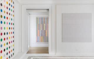
We often select white for clients who collect art. In this circumstance, it is important to find a neutral shade, not too cool or too warm, so that the white walls support the art rather than detract from it. It also supports the home feeling like a welcoming space rather than an art gallery.

In one of the homes where we are currently working, we just went through the exercise of selecting a neutral, overall color. The house has very high ceilings where one room opens up to the next. While tempted to go with one of our favorites, Benjamin Moore Simply White, we decided to go with a pale taupe/grey, Benjamin Moore Classic Gray, to create a feeling of coziness. The result was perfect. Everything feels fresh and light yet is still warm and inviting.

Do you have a project/story that demonstrates an unexpected or particularly spectacular use of white? We recently published a project in Interiors magazine (photos of that project are included in this blog post); the client had an unbelievable collection of art. It was particularly important to find a quiet, neutral white that would feature rather than compete with the art in any way.