
A color that looks right in the morning can feel warmer, cooler, lighter, or darker once the sun moves and the lamps come on. Living room paint colors are especially sensitive to these changes because natural light, bulb temperature, flooring, furniture, and trim are all visible in the same space.
Bay Area homes add another variable. Craftsman bungalows, Victorians, and older homes often have original woodwork, deeper window openings, and rooms with very different exposures. The best approach is to narrow the color family first, then test the actual shade in the room before committing.
Key Takeaways:
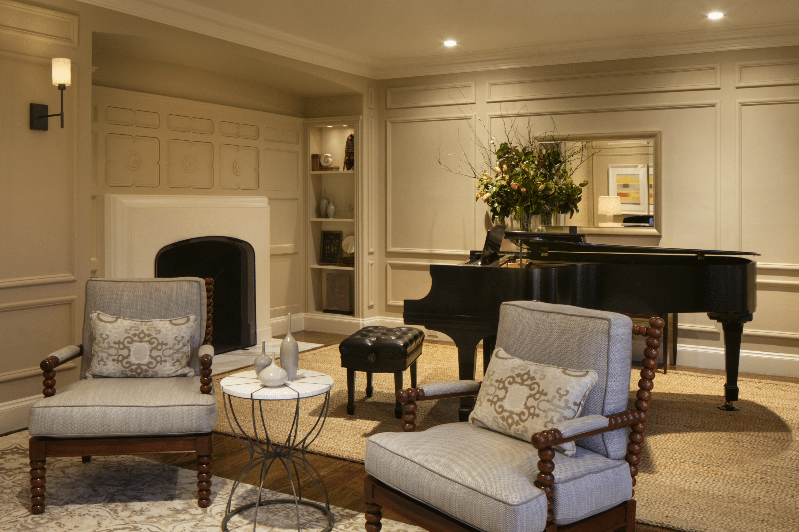
Why Living Room Paint Colors Change Throughout the Day
Paint color is seen through reflected light. When the light source changes, the same wall can appear different even though the coating itself has not changed.
North-facing rooms often receive cooler, indirect light. South-facing rooms usually receive stronger, warmer daylight for longer periods. East-facing rooms are often warmer in the morning, while west-facing rooms can become much warmer late in the day.
Artificial lighting matters too. The U.S. Department of Energy explains that correlated color temperature changes the appearance of light from warm yellowish white to cooler bluish white, and that changing the light source can affect how a space and its colors are perceived. Their guidance on light bulb color temperature is useful when comparing the bulbs already used in a living room.
What LRV Tells You About a Paint Color
Light Reflectance Value, or LRV, describes how much visible light a surface reflects. A higher LRV generally means the color reflects more light, while a lower LRV absorbs more.
LRV does not tell you if a color will look yellow, green, blue, pink, or gray in your room. Undertone, surrounding finishes, and lighting still matter.
Use LRV as one comparison point. A darker room may benefit from a lighter color, but a high-LRV shade with the wrong undertone can still feel wrong beside the flooring or trim.
6 Living Room Paint Colors Worth Sampling
These shades are useful starting points because they cover several common neutral and muted color families. None should be treated as a color that works in every room.
1. Benjamin Moore White Dove OC-17
White Dove is a soft white with warmth. It can pair well with natural wood, cream upholstery, and traditional trim, but the warmth may become more visible under warm bulbs or strong afternoon light.
2. Sherwin-Williams Alabaster SW 7008
Alabaster is another warm off-white. It can soften darker woodwork and create less contrast than a crisp white, but it should be checked beside existing trim so the two whites do not compete.
3. Sherwin-Williams Agreeable Gray SW 7029
Agreeable Gray sits in the greige family. Its mix of gray and beige can work with both warm and cool finishes, but flooring and artificial lighting can pull out different undertones.
4. Benjamin Moore Quiet Moments 1563
Quiet Moments is a muted blue-green with gray. It gives homeowners an option beyond beige or greige while remaining softer than a clear blue or green.
5. Sherwin-Williams Drift of Mist SW 9166
Drift of Mist is a light neutral that can work in rooms where a clean white feels too sharp. Test it beside the trim and under nighttime lighting because subtle undertones become easier to see when the room is dimmer.
6. Sherwin-Williams Comfort Gray SW 6205
Comfort Gray is a muted green-gray. It can pair well with warm woods, natural fabrics, and traditional interiors, but its green or blue side may become stronger depending on the room.
For more ideas on pairing wall color with materials already in the room, read our guide to combining paint colors and textures.
How to Test Living Room Paint Colors Before Choosing
Start with two or three colors instead of covering the walls with many small samples. Large removable samples or painted boards make it easier to compare each shade across the room.
Move the samples near windows, interior walls, trim, flooring, and major furniture. Then check them during the times you actually use the room.
Give the samples enough time to dry before judging them. Our article on how paint color changes as it dries explains why wet paint and finished paint can appear different.
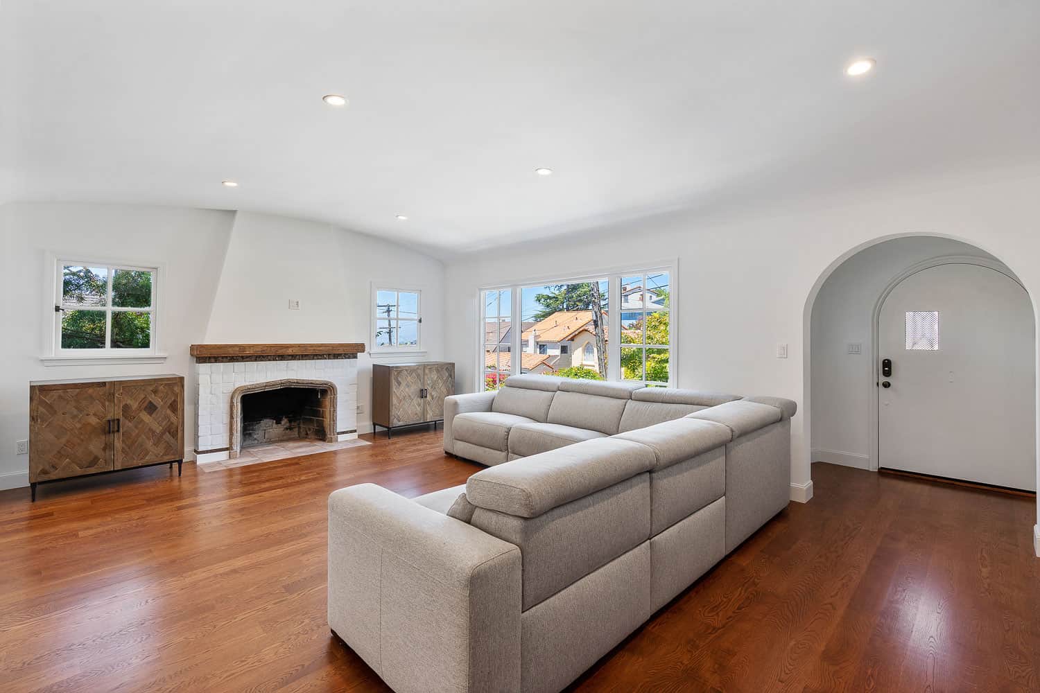
Paint Finish Changes How the Wall Reflects Light
Sheen affects both appearance and cleaning. Matte and flat finishes reflect less direct light, while eggshell and satin add more reflection.
Eggshell is common in living rooms because it provides a low sheen with some cleanability. Satin may fit a busier room that needs more frequent wiping, but it can make wall texture and patching easier to notice under side lighting.
Trim is often finished with more sheen than the walls. If the room includes detailed woodwork, our guide to painting trim or walls first explains how the order of work affects the process.
How a Color Consultation Can Narrow the Choices
A color consultation can help when the room contains several fixed finishes that cannot be changed, such as wood floors, built-ins, stone, tile, or stained trim.
Arana Craftsman Painters states that qualifying interior projects can include a professional color consultation. The consultant reviews lighting, finishes, and the room design before the final colors are selected.
The company also backs projects with a five-year warranty that includes yearly check-ins. Warranty details can vary with certain dark color selections, so the exact coverage should be reviewed in the project quote.
Ready to Compare Living Room Colors in Your Home?
Arana Craftsman Painters serves homeowners across Oakland, Berkeley, Alameda, Lafayette, and other Greater San Francisco Bay Area communities. For qualifying interior projects, the process can include professional color consultation before painting begins.
Schedule a complimentary consultation to review your living room, lighting, existing finishes, preparation, and color options. When you are ready, contact Arana Craftsman Painters at 510-405-3279.