1 Roberts Way Hillsborough Arana Paint and Wallpaper-1

Why You Need a Professional to Paint Your Cabinets

Do you have time to paint your cabinets yourself? Do you know how to paint cabinets? Do you know how to use a paint sprayer? In today’s fast-paced world, you don’t have time to screw up a job like this. You want your cabinets to look good and function properly after a paint job. Not to mention, you don’t want the surrounding areas to be ruined in the process! The condition of your cabinets can dramatically influence the overall ambiance and value of your home. Replacing cabinets is a major expense and painting them has its pros and cons, but can be significantly less costly and provide a dramatic change for your space. While it might be tempting to consider a DIY approach for your cabinets, the benefits of hiring a professional paint contractor are significant. Here’s why:

Knowledge, Skill and Precision

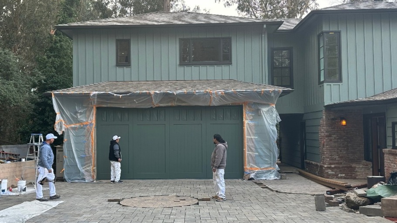
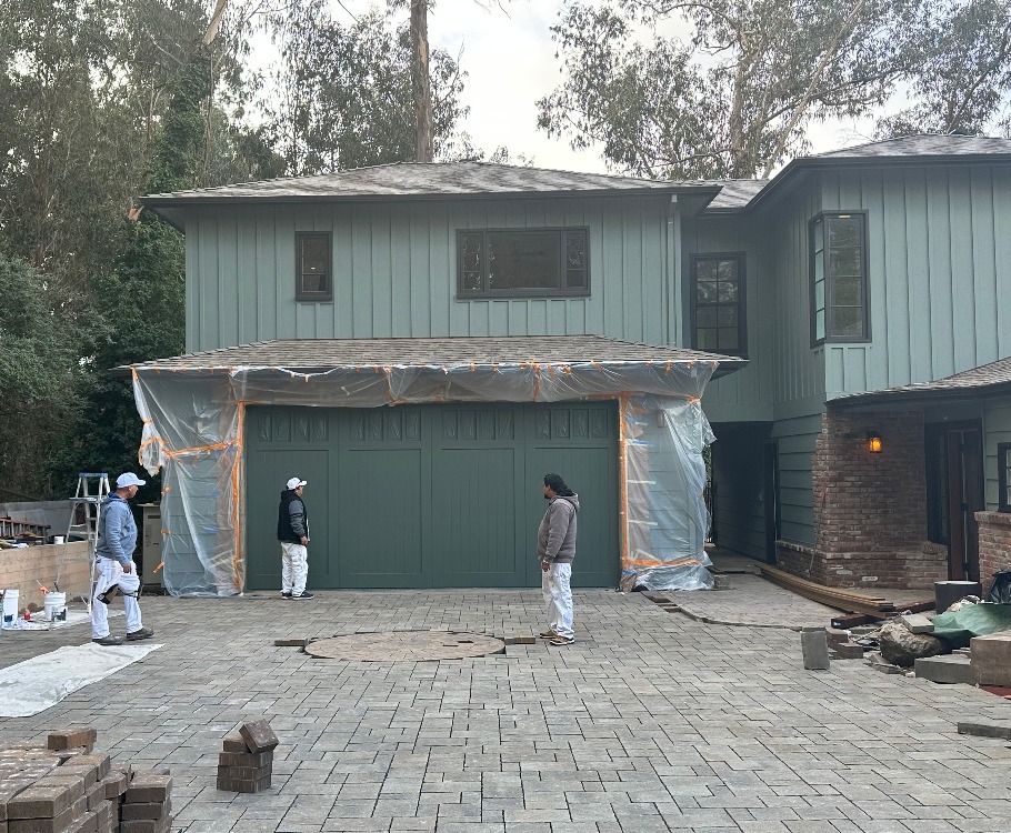
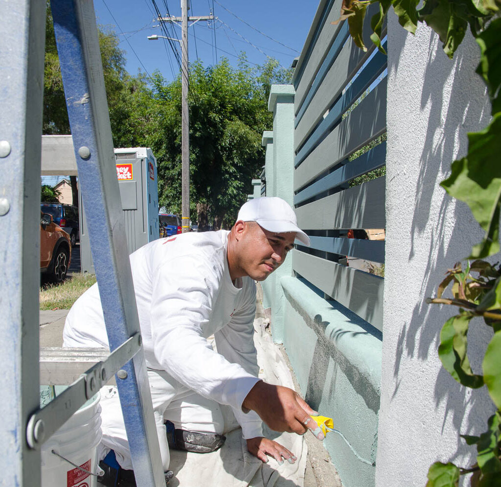
Professional Painters bring years of skilled trade to the table. They know how to manage the process properly from start to finish. From masking the floors, surrounding fixtures and countertops to proper preparation of the surfaces, professional painters will significantly reduce the time and headache involved. If your cabinets are currently stained, do you know what the best primer is to seal the wood tannins? Masking and covering is only one element, cleaning and sanding is another and then priming, patching, caulking and filling to achieve a paintable surface. AND then there is the applying the paint which is only a quarter of the job. This expertise guarantees that your cabinets will not only look impeccable but will also withstand the test of time, maintaining their beauty and durability for years to come.

High-Quality Tools and Materials

When you entrust your cabinet painting to professionals, you also benefit from their knowledge of what constitutes quality tools and materials. From brushes and rollers to paint and primer, caulk and patch materials, professional painters are equipped with everything needed to achieve quality results. These tools and materials, often inaccessible to the average DIY enthusiast, are crucial for achieving a professional-grade finish that enhances the overall look and feel of your kitchen or bathroom.

Time and Cost Efficiency

One of the most compelling reasons for hiring a professional painter to paint your cabinets is because they far more efficient in getting the job done. What might take a DIYer several weeks to complete, a professional can accomplish in a fraction of the time. Saving time is saving money. You are free to do what you’re best at and your living space, especially your Kitchen, is disrupted for a much shorter period of time allowing you to return to normal routine much quicker. Additionally, common DIY mistakes are eliminated, reducing cost and time. Money well spent!

Attention to Detail

The difference between a good job and a great job often lies in the attention to detail. Professional painters (well, depending on which company you hire)  are methodical and meticulous. They have a tried and true process that has worked repeatedly and they ensure every inch of your cabinets is properly prepared, painted, and finished. This includes sanding, priming, patching and caulking, steps that are frequently overlooked or improperly executed by a DIYer or frankly, a bad painter. 

Customization and Personalization

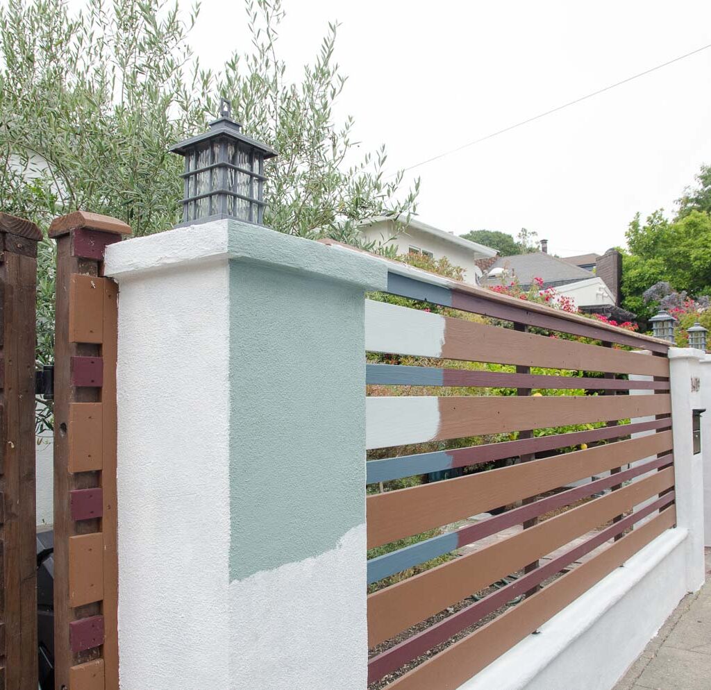
Hiring a professional opens up a world of customization and personalization options for your cabinets that go beyond mere color selection. Professionals can provide expert advice on the latest trends, color schemes, and finishes that can elevate the look of your space. They can also offer solutions tailored to your specific needs and preferences, ensuring your cabinets not only look fantastic but also reflect your personal style and complement the overall design of your home.

Increased Home Value

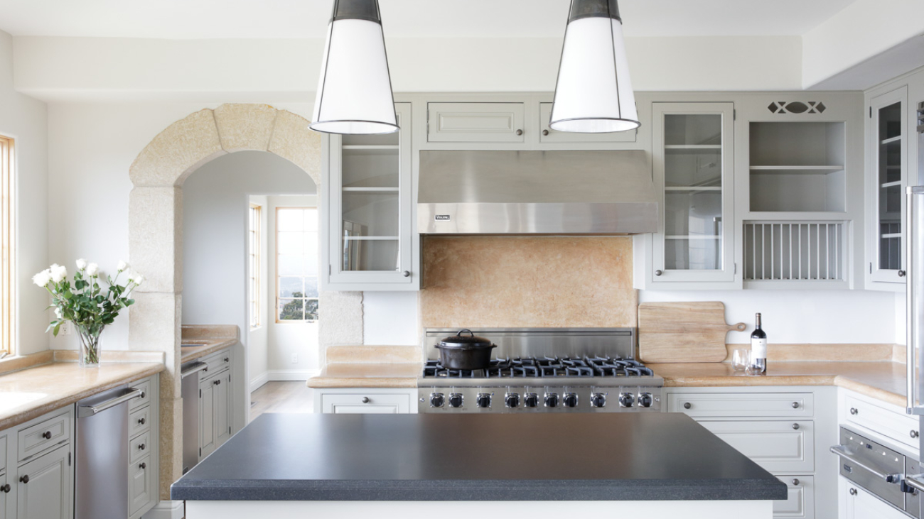
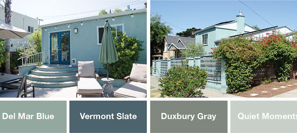
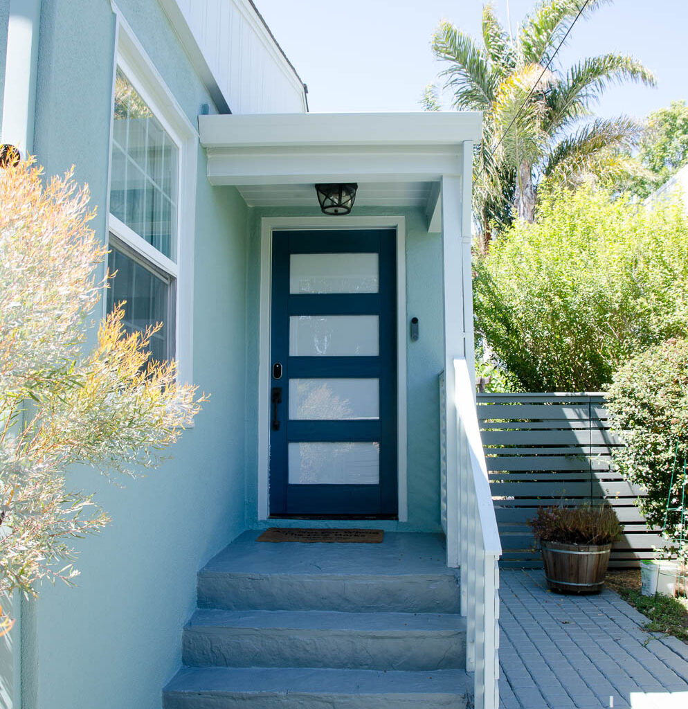
According to iProperty management , paint is a 2.5 times return on investment meaning you will make more money off painting the cabinets than keeping that old dreary color. A cabinet paint job can update and transform the look of your kitchen or bathroom, modernizing them and cleaning them up. You can brighten a space or make it so that the paint goes better with an existing granite slab. This aesthetic improvement alone could sell the house. 

Stress-Free Experience

If executed properly, having a professional painter paint your cabinets can make for stress-free experience from start to finish. You want to look for a company that separates sales from ownership, that has a dedicated Production Manager, that sends you a consistent crew that will start and finish your project. You want a company that provides you with a bid that complies with the Business and Professions code of your state and provides you with a Scope of Work, Work Process describe, properly detailed payment schedule, a notification to cancel contract in 3 days and contact information for your State licensing board. 

While the idea of painting your cabinets yourself might seem appealing initially, the benefits of hiring a professional painter far outweighs the perceived savings of a DIY approach. Call us today with any questions! 510-567-9559

Oakland Kitchen Painting

Oakland House Painting Project Grand View

House Painting Project in Oakland, CA, Grand View.

Rebuilt from the ashes of the Oakland fire in 1991, this grand home with a grand view (on Grand View!) was ready for a kitchen refresh. Arana painted all of the cabinetry, taking it from a dated and yellowy stained wood to this bright and light, more modern design.

About Arana Craftsman Painters

Arana Craftsman Painters is a premier, family-owned residential painting company based in the San Francisco Bay Area. They specialize in both interior and exterior painting, bringing the beauty of homes to life with their expert craftsmanship.

Their services extend beyond painting to include plaster and drywall repair, wallpaper removal, wood restoration, waterproofing, caulking, and sealing. Clients have praised their superior workmanship and reasonable project timelines, noting that their homes look as if they were new after Arana’s work.

Arana Craftsman Painters serves the Bay Area, including cities like Oakland and Berkeley, offering professional painting services for both residential and commercial projects. Their experienced team brings years of expertise to each project, ensuring high-quality results that enhance the beauty and value of homes and businesses.

Alameda House Painting Projects

Alameda House Painting Project Pearl Street

Beautiful home in Alameda we had the pleasure of working on.

We love houses that have lots of decorative details!

These homeowners chose a palette that not only reflects their love of U.C. Berkeley, but also highlights the craftsmanship on the vintage early 1900s woodwork. Choosing a darker gray for below the molding is another creative choice that adds to the curb appeal. And the fact that the houses on either side are gray on the one, and blue on the other, speaks to how choosing a palette can be a decision that plays well with others, and contributes to the beauty of the whole neighborhood.

A little bit about Alameda.

Alameda is a city located in Alameda County, California, situated in the East Bay region of the San Francisco Bay Area. The city occupies an informal archipelago, including Alameda Island and Bay Farm Island, providing a unique geographic setting. With a population of around 77,600 people, Alameda boasts a diverse community, where 24.6% of residents were born outside the United States. Alameda is characterized by its suburban feel, offering a blend of big-city amenities and small-town charm. The city takes pride in its sense of community and local initiatives, such as the “Love Our Island” campaign, which fosters civic pride and engagement

Piedmont House Painting

Piedmont House Painting Project

It is EASY being green… It’s just not easy CHOOSING green

We think this palette is divine!!!👏 Great work on the part of the Designer, Leela Willow.
The color on the garage door is just a pleasure for the eyes!

PROJECT DETAILS: Spray application done by our Craftsman Painter Julio Cadenas on this gorgeous custom garage door. Part of a ground-up addition to a rustic former hunting lodge in the Piedmont Hills.

GARAGE DOOR COLOR: Rainy Afternoon 1575, Benjamin Moore in Satin finish

NOTE: While we love Satin for the way that it can render any minor variations in the underlying surface less visible, as well as for its muted sheen, we generally recommend Semi Gloss — which is a bit shinier, yes, but also more durable — for any exterior wood surfaces.

BUILDER: Alward Construction

COLOR AND DESIGN: Leela Willow

What Is a Color Brush Out?

What Is a Color Brush Out?

A question we often get asked is: “Do you do color brush outs?”

YES. We do!

What is a Brush Out?

A brush out is when your painter takes samples of the colors you are considering and paints them directly on the surface for you so you can see how they will interact with that surface, and how light affects the color throughout the day. Even light bouncing off the floor affects how a color reads.

We find that sometimes our clients need almost-life-sized samples to get a sense of what the final result is going to look like. This is one way we can help people choose!

How big is a brush out sample?

Often we go with a 2ft x 2ft square.

In the images on this post, as you can see, the colors the client is deciding between are not that far apart from each other in terms of tone. This type of choice can be particularly challenging.

The brush-out helps them compare and contrast, and make a better choice!

And yes, we will prime right over those samples before painting the room, so that the final result is clean and even.

Option B is to do brush outs on a card, which doesn’t give the same surface-interaction, but is close enough, and bonus, you can move it around the room to see the light in different areas.

However (are you still with us? This is pretty nerd-level detail…) we prefer painting directly on the wall, especially in older homes where walls often have a texture to them which causes the color to read a little differently.

How can we help you have the best experience with hiring a painting contractor for your home’s interiors and exteriors? Contact us to learn more about our full-service offerings.

Cass Morris 66th St cropped (1)

Rhapsody in Blue-Green: From Arana’s Portfolio

With this recent exterior paint job, performed by Arana Craftsman Painters, this lovely Oakland home went from white-and-brown to shades of blue with hints of green, and gray trim. The color palette was selected by our dear colleague (whose services are included in our whole-house-exterior-paint contracts) Cass Morris.

Cass took in homeowners Kelly and Nat’s lovingly-tended gardens and the neutral tones of existing hardscaping and outdoor kitchen, as well as the palettes of neighboring homes, plus the couple’s general appreciation of blue, to devise this bright, lively, and harmonious exterior paint scheme.

Nat admits that they were initially skeptical. “We didn’t think we’d love having our entire house this color, but we do!”

At Arana, we love when bold risks, guided by experts in the world of color and design, yield such gorgeous results.

Body color (stucco): Benjamin Moore Del Mar Blue #704

“A muted blue-green” that can “quietly anchor” a palette, according to the company’s website

Doors, plus thin rails on front fence: Benjamin Moore Vermont Slate #1673

“Both traditional and modern,” a “cool blue” with “a touch of green”

Porch steps, walkway, plus thick rails on front fence: Duxbury Gray #HC 163

“A unique medium gray with a trace of green”

Door frames, window frames, stair railings: Benjamin Moore Quiet Moments #1563

“A gentle mix of blue, green, and gray… that exudes tranquility and inspires quiet meditation”

Color descriptions from benjaminmoore.com

spirits-distilled-r6-final

Client Spotlight: Bay Area Writer, Mixologist, and Spirits Authority, Nat Harry

We take it as a compliment that so many interesting and accomplished folks in the Bay Area choose us to help them beautify and steward their homes. Nat and their partner Kelly brought us in recently to paint the exterior of their Oakland stucco home. At the time, Nat mentioned to us that they were working on a book — and now it is available for pre-order.

In Spirits Distilled: A Guide to the Ingredients Behind a Better Bottle, author/journalist, San Francisco World Spirits competition Judge, award-winning farm-to-table mixologist, and spirits buyer for high end Bay Area liquor purveyors, Nat Harry (re)introduces readers to the fruits, plants, and processes that form the backbone of the world’s most popular and in some cases underappreciated spirits. Their approachable and encyclopedic accounting invites readers to thoughtfully regard everything that goes into a spirit, what makes good, good; including the skilled hands that turn those ingredients into art.

About the timeline for publication, Nat reports, “The hard-copy will be coming out in August. We don’t have anything lined up yet, but I am looking forward to doing a bunch of local events — we will have a book launch party at one of the Future Bars Group locations.”

Future Bars owns 10 bars in the Bay Area and two shops including Cask on College, where Nat once curated the spirits selection. “I also plan to do talks at distilleries, producers, and distributors,” they add. To stay up to date on book-related appearances and mixology class offerings, subscribe to Nat’s newsletter at their website: www.natharry.com.

In their 20+ years in the industry, Nat Harry has traveled the world to hand-pick their recommendations for the world’s most unique and exquisite craft spirits. In Spirits Distilled, they share their knowledge, providing an informative guidebook as beautifully-crafted visually as it is detailed and informative. Pre-orders come with a complimentary (virtual) mixology class with the author: www.westwoodpress.com/our-books/p/spirits-distilled

Lincoln-street-1-1

Berkeley House Painting Project Lincoln Street

Beautiful Home in Berkeley, CA on Lincoln Street. We had the pleasure of painting this historical beauty.

The perfect finish is only achieved through perfect preparation. We lovingly restored this stately 1893 Berkeley Victorian, down to every last decorative detail.

A little bit about the beautiful town of Berkeley.

Berkeley, California, is a vibrant city located on the eastern shore of San Francisco Bay in northern Alameda County. Named after the 18th-century philosopher George Berkeley, it is renowned for its dynamic blend of history, culture, and progressive thought. Established in 1868, the city is perhaps best known as the home of the University of California, Berkeley, a premier public research university that has significantly influenced the intellectual and cultural fabric of the region.

Berkeley’s landscape is characterized by its picturesque setting between the Pacific foothills and the San Francisco Bay, offering residents and visitors alike stunning natural beauty and a variety of outdoor activities. The city has a rich history of countercultural movements, particularly during the 1960s, when it became a hub for free speech and anti-war protests. This legacy of activism continues to shape its progressive policies and community initiatives today.

The city’s eclectic atmosphere is reflected in its diverse neighborhoods, each offering unique attractions and experiences. From the bustling Downtown area with its array of shops, restaurants, and theaters, to the tranquil residential streets of the Berkeley Hills, there is something for everyone. Cultural landmarks such as the Berkeley Repertory Theatre and the Berkeley Art Museum and Pacific Film Archive further enrich the city’s cultural landscape.

Berkeley is also known for its commitment to sustainability and environmentalism. The city has implemented various green initiatives, including extensive recycling programs and the promotion of renewable energy sources. This dedication to sustainability is mirrored in the lifestyle of its residents, many of whom embrace eco-friendly practices.

In summary, Berkeley, California, is a city that seamlessly blends academic excellence, cultural diversity, historical significance, and a strong commitment to environmental stewardship. Its unique character and enduring spirit make it a notable and influential part of the San Francisco Bay Area.

Slate-Art-Painting-thumbnail

Steps to Buying Art for Your Home with a Professional Art Consultant

“When the sun is out and the pool is warm,” by Sheldon Greenberg. 48 x 40 in. Oil on canvas. At SLATE contemporary gallery.

SLATE contemporary is an art consultancy firm providing a personalized art collecting service, helping homeowners and businesses select the exact right art for their spaces.

During this process, we get to know you and the architecture of your home, and determine a selection of pieces that will suit your desired feeling, tone, your personal taste, the available light, the present or future interior design, your personal taste, and how you and your family and friends will enjoy the space. Below is a description of the process as it typically unfolds. Of course, options and adaptations are offered to suit each client’s individual circumstances.

These are the steps to the process of choosing art with a consultant:
1) Virtual gallery walk-through: Potential clients are invited first to look through SLATE’s website and let us know what they like, what they definitely don’t like, and what they are ambivalent towards. We are not limited to what’s on the site when we help clients collect, but we like to use our website as a diagnostic tool. This helps us get a sense of our client’s taste and style.

2) Home (or site) visit: We work with clients to identify potential locations for art, we measure the walls, and take photos. During this visit we look at images of artworks together. Sometimes, through this process, we are helping clients to identify or articulate their taste for the first time. Occasionally, when working with a couple, they each have different tastes and that can be very challenging. Sometimes we can find art that has elements that they will both like, sometimes we agree to let each one of them choose one piece, or each choose art for a different room. Sometimes, if those solutions don’t work, the truth is, we can’t help them. Also, for every project, every location, we are making a judgement call. Sometimes it’s a more personal decision, based on how the collector connects emotionally to the artwork. Sometimes it’s more of a design decision. For example, a room that is very neutral in overall tone might be desperate for color. Or if you have a very vibrant, visually-busy space, then the art might need to be quiet to create breathing room. All that said, it can also be nice to throw in a surprise, or chose a piece that creates visual tension, so the design doesn’t feel too predictable. In all of these ways, we are responding to what the space, and the client, needs.

3) Virtual art placement: At this point, we have developed a list of suggested artworks for specific locations, which we share digitally. We may make digital mockups showing artwork in situ, using the photos we took during the home (or site) visit.

4) Feedback: The client indicates their favorite selections.

5) Private viewing: We invite the client to the gallery for a private viewing, to see the potential selections in person. For this appointment, we may be retrieving pieces from our storage, or from the artists themselves. (NOTE: Anyone is welcome to visit SLATE gallery to see the works currently on display. However if there is a specific piece from the website you want to view, in order for us to have it ready for you, you may need to make an appointment.)

6) Short-list selections: We work with the client to further narrow down the list of pieces they want to view in their home.

7) “A man and a van:” We deliver the art to the client’s location — to meet with the client and the pieces in situ, for final decision-making and purchase. (There is a small fee for delivery, which, if the client makes a minimum purchase of $5000, the service fee is waived.) Some clients choose to skip steps 5 and 6, instead having many or all artworks under consideration brought to their home, in one, or repeat visits. We are happy to do this, however additional delivery fees apply.

Bonus tip: Whether to choose art at the start of a design/remodel project or the end
Art is often chosen at the end of an interior design project or remodel, once the design and furniture is all in. The advantage of this approach is that we can use art to balance or fine-tune the design.

However, at that point, clients are usually in a hurry to see their project completed, and ideally, building an art collection is not done in a rush. Also, it may be too late, at that point in the process, to adjust window treatments, lighting, or wall color, all of which will have an impact on how the art reads.
If you select the art first, you can create an environment for it during your renovation that makes it really sing.

Click this link to read more about Danielle Fox and SLATE on our blog. Learn more about SLATE contemporary at www.slateart.net

Danielle Fox of SLATE contemporary. Photo credit: Lauren Edith

Eureka2

Interior Color Trends for 2021

While some might be thinking that we are jumping the gun a little, others feel the same way, 2020 can be over. There isn’t a guarantee that a new year means the place gets back to normal, however, there is hope. While many of us spent most of our time at home in 2020, we probably have noticed that our interiors are getting a little outdated. Perhaps you need to freshen up the paint a little. If we are going to be spending more time at home, then shouldn’t we be enjoying it? Let’s make the inside of your home beautiful. Warm calming pastels along with cheerful and bright colors. After all, we could all use a little cheer after this year!

2020 wasn’t all bad, well, it was mostly, but think about the hobbies that you picked back up. Or the extra time you got to spend with your family, the good times. Many of us got to get back to nature and enjoy the outdoors more, since, well, that was pretty much the only place we were allowed to go. During this time vacations were canceled and many of us started investing in the beauty of our own homes. We were busy creating beautiful art for the walls and designing that new garden.

As 2021 rolls in, many fashion designers are thinking that the colors for the year are going to be back to nature with a pop of bright. Let’s take a look at what we mean by that.

The colors of 2021
Brave Ground is a dulux color that some of the design experts have chosen as one of the more popular colors of 2021. This warm and earthy tone brings in nature to the interior. It provides a firm foundation for creativity and change. The color represents growth, stability, and potential. This color can be easily combined with other colors in all kinds of ways.

Forecast is another potentially popular color palette for 2021. This color palette offers a sense of comfort and familiarity. These color choices offer a reset, retreat, and nourish. While holding onto a sense of nostalgia, this color palette offers rejuvenating and aesthetic pleasing hues. As life in 2020 may seem a little slower, we like to think that these colors can be a way to bring in the cheer.

The rest palette is a palette that is a little more upbeat. This is sure to bring some cheer into your home. Why not brighten your tone and outlook with some of these bolder tones. While this palette is of brighter tones, it also has a sense of the 70s. This nostalgic look is something that seems to be getting more popular in recent years.

The palette Nourish demands attention and offers a send of unplugging and being in the present moment. This palette is said to offer some rejuvenation of your soul. While it does lean to the more nurturing side, the colors of this palette are warm earth tones such as browns, greens, and yellows. This is an excellent palette choice if you need a sense of warmth and acceptance. It offers a sense of softness that allows your furniture and home decor to meld. Admire your tranquil surroundings with the Nourish palette.

More 2021 Paint Color Choices.
The retreat palette is a mixture of security with a side of comfort. Your home is your central hub for just about anything these days. Many of us are finding that it is where we rest our heads but also where we eat, workout, and even work. We are spending more time in our homes than ever before, so it is important that we are comfortable. The retreat color palette is made to offer this level of comfort. The hues of this palette are very earth tones with browns, blues, and dark greens. While our lives start to be more around your home, you find yourself having to blur the lines of work, relaxation, and play. This is the color palette for you.

Jotun Lady
Jotun Lady is a paint company out of Norway. They have come up with a four color palette collection that is called Rediscover. Rediscover is about finding new ways to play with the different color options and combing in colors in ways you never thought possible.

Warm and rustic colors are what you’ll find in the first color palette. In this palette think about the Moroccan desert sand that is rich with golden pinks or the burnt oranges that we think of than we think of Mexico. This is to incorporate the love of culture from around the world. These are really rich and warm color tones. The pinks, orange, and tans are colors that are warm and inviting.

Soft and Neutral colors
The soft and neutral colors are gray, light tan, and light browns. This palette is timeless hues that go with all kinds of different pallets.

Dreamy Pastel Hues
This palette is meant to bring Scandinavian village into your home. This color palette is very warm and earthy. These are fun and light color options that can really brighten up your home and make it quite beautiful.

Airy Blue Tones
The airy blue tones make your home fun and airy. It is very peaceful and offers a great sense of peace. This color palette is a wonderful way to surround yourself with calm colors and enjoy the cozy environment. Making a cozy environment that allows you to recharge your batteries. These blue-grey hues are perfect for those places that you want rest and comfort in. Places such as the bedroom or living room. This brings in the quiet tranquility of these colors found in nature.

Urbane Bronze is Sherwin-Williams color of 2021
While we have some various color palettes mentioned. We wanted to also take a look at what Sherwin-Willams chose for their color choice of 2021. While we are all stuck inside, it is important to remember that you don’t have to look at drab walls. You can have fun with your interior, afterall, you are staring at it more than normal. This Urbane Bronze is a nice warm color that brings a bit of cheer into a drab world.

Behr Color Trends of 2021
Behr, another leader in interior paint also has their palette for 2021 that are divided in 6 color themes. Casual comfort is beautiful light colors and a calm zone are another color choice. These beautiful greens and blues are in the clam zone. Subtle Focus is another group of colors that Behr recommends that is very sophisticated. In the Quiet Haven collect they offer a peaceful oasis with deep hues. Optimistic view is a wonderful collection that is a pop of bright color.