When it comes to giving your home, a fresh look does it make sense to go full DIY (Do it Yourself) or hire you’re a professional painting contractor? This is a common predicament for homeowners. Each approach offers its unique benefits and considerations, which we will explore in detail to help you make an informed decision.
DIY Painting: Pros and Cons
Who doesn’t love to do things themselves? It can be cost-effective and of course you can have the satisfaction that you did it yourself. It also allows you to express their creativity and put a personal touch on your living spaces. Here are the key aspects of DIY painting:
The Pros:
- Cost-Effectiveness: To pay for skilled labor can be expensive. Materials costs are the same for you as they are for a painting contractor, but you don’t have to cover liability and worker’s compensation and payroll taxes for the skilled labor.
- Flexibility and Control: DIY projects offer the flexibility to work at your own pace and make changes as you go. You have complete control over the color choices, paint quality, and techniques used.
- Satisfaction and Accomplishment: Completing a DIY painting project can provide a sense of achievement and personal satisfaction.
The Cons:
- Time and Effort: Painting is time-consuming and physically demanding, especially for larger projects or spaces with high ceilings and intricate details.
- Skill Level: Without professional experience, achieving a high-quality finish can be challenging. Mistakes and inconsistencies may require additional time and resources to correct.
- Equipment and Materials: Proper painting requires specific tools and materials, which can add to the overall cost and complexity of the project.
Benefits of Hiring Professional Painters
Professional painting services can make a project go much smoother and can significantly enhance the beauty and quality of your project. DIYers need to consider which 2 of the 3 elements of a project are their priorities: Quality, Time and/or Budget. The advantages of hiring a painting contractor includes:
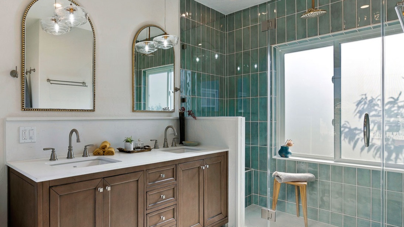
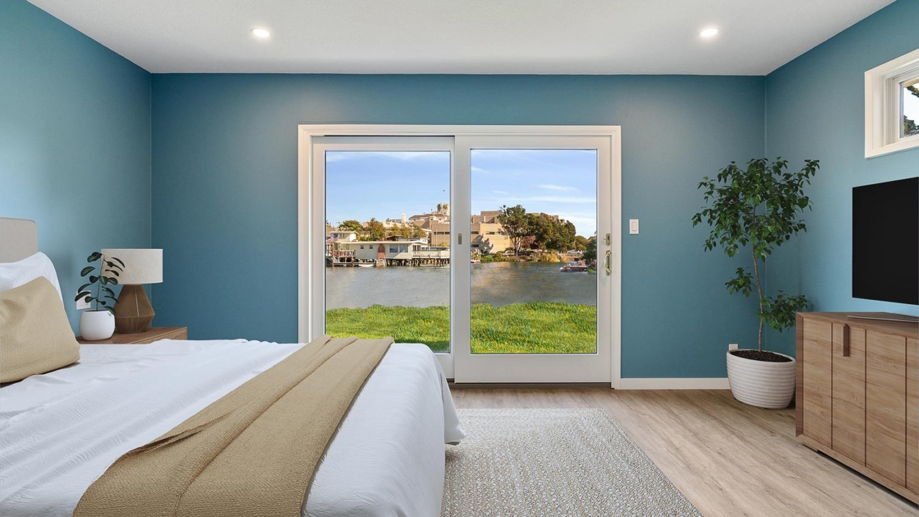
- Expertise and Quality: Truly Professional painters bring years of experience, ensuring that the surface was prepped correctly, to produce a visually pleasing, even, and long-lasting finish.
- Efficiency: Skilled painters know how to begin and end a project efficiently, often moving more quickly than a DIY effort. This can be particularly advantageous for tight timelines or large-scale projects.
- Equipment and Techniques: Professionals have access to the specialized equipment and tools as well as the more effective work processes that might not be feasible for DIY painters.
- Stress-Free Experience: Hiring a professional may mean no stress for you. You won’t have to deal with the a heavy work load for weeks on end, you won’t have to deal with waste and proper cleanup and you will be able to focus on other aspects of your life.
The reality of hiring a professional painting contractor is that their services will cost. Professional painting is almost always significantly more expensive than a DIY effort, depending on the scope and complexity of the project.
When to Choose Professional Painting
While DIY painting can be rewarding, certain scenarios call for professional expertise:
- Complex Projects: Intricate designs, high ceilings, and exterior painting often require the skill and equipment of professionals.
- Health and Safety Concerns: Professional painters are equipped to handle lead-based paints and other hazards safely.
- Time Constraints: If you have a tight deadline, professionals can complete the job more quickly and efficiently.
- For the DIYer keep in mind: For a successful paint job, preparation is key
Adequate preparation is essential for a successful paint job, whether DIY or professional.
- Surface Preparation: Ensure walls are clean, dry, and smooth. Repair any holes or cracks and sand surfaces as necessary.
- Quality Materials: Invest in high-quality paint and brushes. Quality materials can result in a more professional finish and longer-lasting results.
- Protecting Your Space: Cover floors and furniture with drop cloths, and use painter’s tape to protect trim and ceilings.
- Making Your Decision: DIY vs. Professional Painting
The choice between doing it yourself and hiring a professional painting contractor depends on a variety of factors:
- Budget
- Time
- Skill level
The complexity of the project. For those seeking a cost-effective, self-paced approach, DIY painting can be the right choice. However, for high-quality, efficient, stress-free and great looking result, professional painting services are the ideal solution.
Do not discount the importance of proper planning, preparation, and the use of quality materials. With these factors in mind, you can transform your space into a beautifully painted home that reflects your style and meets your needs.