Mountain Gate Ave

Restoring and Maintaining Home Exteriors: Stucco, Shingles, Siding, and Brick

Got Home? We’ve Got an Exterior Paint Process For It

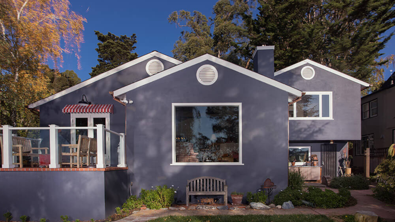
The Bay Area sings in a chorus of varied genres of architecture. From Eichlers and Craftsman Bungalows to ornate Victorians, robust Colonials, and magical Storybook houses, each genre is unique. What makes a style remarkable is in part how it features a specific set of materials. Arana views any home we are invited to work with as a treasure. We combine artistry with craftsman utility to not only beautify but also to protect the home for the long term.

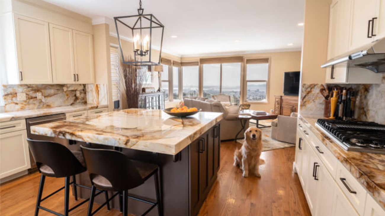
While many houses in the Bay Area are around 70-to-100 years old or more, that timeline is nothing compared to the thousands of years that castles built in Europe have stood. Coming in somewhere between that kind of longevity and what is available to us if we are thoughtful and caring with the tools and materials available to us today, we present this article describing how we handle the types of exteriors that make up the majority of homes of The Peoples of the Bay Area: Stucco, Shingle, Siding, and Brick.

STUCCO: This home exterior material is a personal favorite of mine because it is infinitely easy to maintain — which makes it more environmentally friendly as well, in our opinion. We see in the industry a rise in the use of “sustainable” products, but if these are not also long-lasting, and must be replaced 2-to-3 times more often, then to us, that product may not in fact good for the environment. Stucco (as long as it is applied to a home NOT built on a hill near an earthquake fault) can go 10-to-20 years without needing new paint. As long as there are no cracks left unsealed, you don’t have to do much to it. Open cracks can let water in and that allows rot to develop underneath. The downside of stucco is that a whole wall of your home might be rotting away inside the stucco and you might not know about it.

Our process for maintaining, restoring, and beautifying stucco: We scrape and sand any peeling paint. For any cracks, we open them up, check for water damage underneath, and re-patch them. We spot prime and only if necessary, fully prime the whole house. If your house has a pre-colored stucco that is being painted for the first time, we can expect that a lot of primer will be needed, as unpainted stucco gets “thirsty,” drying out as it ages.

Let’s talk about elastomeric (“terpolymer” paint) on stucco: While we understand that it has some desirable qualities, as it is useful for waterproofing or bridging small cracks, it is only effective under the right conditions. If your stucco is in bad shape, and/or if you already have years of paint build-up, elastomeric is not the right choice. It cannot replace necessary repairs and upkeep. And please do not rely on elastomeric to solve all of your waterproofing problems! Elastomeric is best used on new stucco. If used on previously painted stucco, it is important not to over-apply it; results may vary depending on the texture of the stucco. Our advice is to research very carefully before you choose this product.

SHINGLES: Cedar shingles are not the most common material, but you will see them on homes across the Bay Area. Cedar is an amazing and versatile wood product, but it can become susceptible to breakdown in a shingle format. Varying approaches may be taken on how to treat them.

New shingles: Some homeowners choose to let the shingles stay raw and cure in the sun, causing them to turn gray. While this is a viable approach, we recommend at least that you have a clear sealer with a UV protectant applied to will help to protect the shingles from sun damage over the long term. This coating should be reapplied about every 5 years.

Cedar shingles that have been coated with a semi-transparent stain product: Over time, stained shingles develop tannin spots and will go grey or even totally black. To maintain a specific color and appearance we recommend using a wood brightener product that can be sprayed on and then gently scrubbed into the shingles with a stiff-bristle nylon or utility brush. Scrubbing enables the product to penetrate and remove the tannin stains as well as other types of mildew and grime.

The shingles should then be rinsed with a pressure washer (professionals-only, please). Once the shingles are nice and clean, we apply our favorite stain product: Messmers. Whether clear or one of their stock colors, we highly recommend Messmers as it results in a beautiful and long-lasting finish. NOTE: It is best to hold off on repainting the painted-wood elements around the shingles until after this process is completed, as any accidental contact from the wood-brightener product can mar a newly painted surface.

Cedar shingles that have been coated with a semi-solid or solid stain product: These types of stain products can partially or fully obscure the grain pattern of the wood. These products are used to achieve a color rather than enabling a proper marriage between color and wood grain. Any stain will fade over time, but with these types of products, you may also see peeling, flaking, or scratches — that become unsightly more than anything. Again, cedar is a hardy wood that will not rot, but in a shingle format, it does tend to break down slowly over time. A good general pressure wash of semi- or solid-stained shingles and a reapplication of the stain product in a one- or two-coat process should suffice, depending on the original product used and the condition of the wood.

Painted Shingles: Yes, this is a thing and we consider it almost a last resort, or if you simply must have a fully painted shingle home. If you don’t already have painted shingles, don’t do it. The amount of maintenance painting shingles can create is unpredictable, with each shingle potentially becoming a peeling-paint mess. To prepare and repaint this type of home, we would use the same process for painted shingles as for siding (see below). Another option is to replace your cedar shingles with HardieShingle® siding which is a fiber-cement product that is gaining in popularity.

SIDING: There are different varieties of siding your home can be built with. The original redwood of the SF Bay Area, cedar, pine or Douglas fir, or vinyl, or HardiePlank® Lap Siding which is a fiber-cement product that we are seeing on newly-constructed homes. HardiePlank is a pre-colored product that can later be painted when you are ready for a change.

Our process for painted siding, as with any painted surface: Scrape and sand any loose or peeling material. On wood surfaces, rot may need to be repaired or replaced. Repairs on damage to wood siding can only be done on areas that are no bigger than 4” x 4”. For these, we scrape out the rotted wood, apply a liquid that kills the dry rot organism, and then apply a two-part resin product that fills in the gap. We then apply a full coat of primer to those repairs and to the whole exterior of the home as needed. Next, we go over the entire surface area to inspect and caulk open gaps, in order to create a paintable surface.

BRICK: Brick homes are rarer in earthquake-prone California, but they are here, and we do work on them. Oftentimes bricks can absorb dirt and accumulate mold and mildew which can make them look drab. We recommend a careful pressure wash and scrub to brighten the bricks. Like any concrete or stone product, brick can erode over time and lose its shape. We recommend a clear sealer to prevent this. One that we use is Drylock. If you are going to go DIY with this product, please be sure to get it in a flat finish because shiny is no bueno on bricks!

Jeff & Sio-172-2-Edit-Edit

10 Things to Consider When Choosing Paint Colors for Your Interiors

By Judy Dinkle, Interior Designer and Color Consultant

Interior Designer Judy Dinkle is one of Arana’s go-to color consultants for our clients. As part of the service we provide, we include a free one-hour paint color consultation for whole-house interior or whole-house exterior contracts. We asked Judy to give us some pointers that we could pass along to our community; things to keep in mind when selecting paint colors for your home.

Judy says:

  1. Choose right the first time. Paint may not be that expensive, but labor costs can add up. Choosing colors carefully at the start of a project will save you time, and money, later on.
  2. Follow the “Rule of Three.” To give your room a sense of depth and a feeling of being thoughtfully designed, choose three colors that work well together for your wall color, accent color, and secondary accent color.
  3. Be bold. Often, I find that homeowners are afraid of being too bold, or of choosing colors that are too personal. I recommend choosing colors you will love living in. Your spaces will be more welcoming and authentic as a result. If your favorite color is red, paint a room red! Or choose an accent area to paint red, and add red pillows. The truth is, any color can look good if it is properly integrated into the palette of the home.
  4. Look in your closet for inspiration. When I ask my clients, “What would you like?” and they just don’t know — I ask them to show me their closet. The colors that are in your closet tend to be what you naturally gravitate towards and look good in. The spaces in your home should feel good and flatter you in the same way.
  5. Pick a color from your favorite BIG things. Another way to get your color cues is to look to the strongest and largest pattern in a room. Begin with a beloved piece of furniture or a rug, a stone countertop, carpeting or wood floors, one visually striking item that is very large in the space. Pick a color from that piece or pattern and start from there. That might be your wall color, or you might choose a more neutral wall color that compliments it, for example, a shade of white or ecru.
  6. Pair colors to enhance the energy of the space. In general, pairing colors that are adjacent to each other on the color wheel enhances the mood they project. Pairing cool colors such as blue and green in a room will lead to a more casual or relaxing feel that will work best in your informal and private spaces, like the bedroom. Reds and oranges together are warm and energizing — good for places where you want a lift such as a laundry area, entry, mudroom, or a home office or workout space.
  7. Skip the beige, or give it life. People tend to like beige because it’s safe. But it’s also pretty blah. If you want to do neutral well, the trick is to contrast cool and warm tones. For example, a warm beige-y-wheat paired with a cool gray can create a little tension that is more interesting to look at than if you chose all shades of the same neutral tone.
  8. Create a color strategy for the whole house. We don’t want every room to be the same color, but we do want all of the colors throughout the house to have flow. A red sofa in the living room might be echoed by a burgundy accent color in a bedroom. You might take a bright cabinet color like sea green in the kitchen and repeat it in the palette of an adjacent great room or dining room, in painted accents or in the pattern of the pillows or curtains, so that those spaces talk to each other.
  9. Go BIG in small spaces or places. Small spaces, like powder rooms, for example, can be a fun place to apply your boldest, brightest, deepest colors on the walls. While in general, painting a room white will make a tiny space look bigger, I like to give more power to a space by using bold color. Let your big rooms expand with the lighter tones and have the small spaces be more cocooned and impactful.
  10. Choose the right finishes. A good rule of thumb is to always do painted-wood trim in a furniture finish, like satin, rather than a semi-gloss; it looks richer. Sometimes I break this rule and choose to paint a door, wall panel, or divider screen in a high-gloss for drama and shine, however, the surface needs to be nearly flawless to begin with and the preparation of that surface also has to be perfect because high-gloss shows every imperfection. So choose wisely, (and hire a good painting contractor, of course).

Credits for images in this post:

PHOTO CREDIT: Garett Wisesan

PROJECT CREDITS: Painting Contractor: Arana Craftsman Painters; Color Consultant and Interior Designer: Judy Dinkle

Judy Dinkle of JD Designs is an award-winning interior designer located in the Bay Area. You are welcome to contact her directly about her color consulting and design services at [email protected] or 925-330-6774. Learn more about her work at www.houzz.com/pro/judydinkle/judy-dinkle-jd-designs

Great Room Judy Dinkle Houzz

Think Like an Interior Designer: More Tips on Choosing Colors for Your Home

By Judy Dinkle, Interior Designer and Color ConsultantJudy Dinkle headshot

(Part 2 of 2) Approaching a whole house interior painting project can easily feel overwhelming.

As an interior designer and as a color consultant working with Arana’s clients, I see this all the time. It’s why I do what I do, and why I am happy to help when Arana refers me for a project. Here are a few strategies I use to help guide clients to making the right decisions on paint colors for their homes.

Where to begin:

When faced with selecting a palette for your home, I recommend starting with the more public spaces, the living room, dining room, and entry. Once we find a palette we like for those areas, then the colors for the adjacent rooms end up jumping off from the main colors of the formal entertaining areas. Thus after the formal areas, choose related colors for the family room, primary bedroom, guest room, powder room, bath.

While it might be tempting to apply one palette of three colors throughout, if you paint the whole-house interior all the same, you will end up dulling down the impact of those colors.

How to make a room look thoughtfully put together:

If you want to think like an interior designer, try decorating from dark to light, vertically, in this order: floor, walls, trim, crown molding, casing, ceiling.

For example, if your floor is super dark, the walls might be a medium wheat gold, then the crown molding and casing around windows and doors might be a lighter tint of that or a warm white that picks up the warm tones of the gold, or you could choose a light gray wall color paired with a cool white with a touch of gray in it for the woodwork.

Designer Mark McCauley, says this “cookbook” method to color selection tends to work because it mirrors what we experience in nature: “Any interior space replicates the outside world. The exterior environment is generally darker below our feet (the earth itself), medium-valued as you look straight ahead (buildings/trees) and lighter skyward.”

When to paint it black?

Some designers have a rule to add a little bit of black in every room. This technique is very popular now, and I think it’s a good idea but I don’t automatically do this in every room. Still, it’s a tool that works. Black acts to clarify a room’s colors. The black could be the hardware on cabinets, it could be a faucet, a light fixture… also, you want to repeat it in a number of accents in the room to help create balance.

Accents like this are like adding jewelry to a perfect outfit. Sometimes I like to use black on a painted floor register or heating vent, especially with older houses that might have vent covers that are very decorative. I might find a place to repeat that pattern elsewhere in the room, also. Other opportunities for black include the stove hood in the kitchen, older light fixtures, door handles.

Other accents that many people may not realize are paintable include brick fireplace surrounds or even the treads and risers on a staircase! Paired with a nice runner, a painted stair system can look fabulous.

When to paint it gray?

In general, like black, a good gray also is a neutral you can use to accent space and pull things together from one room to another. Gray is also popular now. I advise caution; despite what you see in the magazines, I say do NOT do ALL light gray and white. Rooms still need color: pops, accents, artwork, graphic patterns on sheets or towels, an accent wall.

Gray is a great supporting player. Gray’s chameleon-like quality invites other colors to appear either warm or cool depending on the tone of gray you choose, and grays can pair beautifully with both pastels or stronger colors like hot pink, Kelly green, or citrusy shades.

Still stuck? Consider timeless pairings:

Still not sure where to begin? Consider timeless pairings to help choose a palette: start with black and white, or blue and white. Try this in a bathroom and then accent with metallic, copper, brushed bronze, or brushed brass. The metallic will balance the contrasting colors and make your space look more thought out.

You are welcome to contact Judy Dinkle directly about her color consulting and design services at [email protected] or 925-330-6774. Learn more about her work at www.houzz.com/pro/judydinkle/judy-dinkle-jd-designs

Oakland painters Arana Craftsman Painters

What Is Pantone’s Color of the Year?

What is the color of the year and why is it relevant? Is there just one? Under the heading of nothing is as simple as it sounds, there are multiple answers to these questions. Color of the Year, as announced by the Pantone company annually in December, is a relatively new phenomenon that began in the year 2000.

The Pantone announcement doesn’t just relate to house painting, but rather is an analysis of past color trends in industries including fashion, marketing, and business, as well as the mood of the culture, influences in the environment, for products and design, and a prediction (although some would say, this announcement drives the market) of what color will be relevant for the following year.

This annual event originated as a way to generate excitement about color. And the paint companies soon followed suit, announcing their own colors of the year. Basically, it’s all about marketing and P.R. But it’s also A LOT of fun to witness the reveals.

We also want to direct you to herein to projects in our portfolio that are similar to the selections being highlighted by Sherwin Williams and Benjamin Moore this year.

Note that the paint company colors tend to have almost no relation to Pantone’s announcement, visually, but rather are relevant to what has been trending in the design industry, specifically. Pantone’s color choice tends to have a direct bearing on consumer goods and fashion, including what colors the iPhone will be available in, for each year.

We like to use the annual announcements as an opportunity to reflect on the jobs in our portfolio where that color has been successful for us in the past.

Sherwin Williams selected a shade of teal (“Agean Teal”) that is somewhat similar to this very popular kitchen cabinet project, color specification and interior design by LMB Interiors: Hillsborough Kitchen Remodel

And Benjamin Moore’s “Urbane Bronze” is quite close to the colors famed designer John Wheatman selected for the exterior and basement of this august, North Berkeley home: Berkeley Basement Dig-Out

For our designer colleagues and for our homeowner clients, we see the annual announcement as a point of consideration — to explore the different feelings that the color might evoke, and a point of inspiration, an opportunity to make changes — as a professional retiring an old stand-by go-to color, or as a homeowner deciding to refresh a space.

Did you know? Arana puts together a book for interior designers each year about the paint companies’ announcements and the impact, which is available for download on our website in the resources section.

pantone-color-of-the-year-2021-for-fashion

Pantone’s Color(s) of the Year for 2021: Illuminating and Ultimate Gray

For 2021, for only the second time in its 20-year tradition of choosing the color of the year, Pantone selected a duo: gray and yellow. Their explanation is, as always, epic poetry:

“Ultimate Gray + Illuminating, two independent colors that highlight how different elements come together to support one another, best express the mood for Pantone Color of the Year 2021. Practical and rock-solid but at the same time warming and optimistic, the union of Ultimate Gray + Illuminating is one of strength and positivity. It is a story of color that encapsulates deeper feelings of thoughtfulness with the promise of something sunny and friendly.

“A message of happiness supported by fortitude, the combination of Ultimate Gray + Illuminating is aspirational and gives us hope. We need to feel that everything is going to get brighter – this is essential to the human spirit.

“As people look for ways to fortify themselves with energy, clarity, and hope to overcome the continuing uncertainty, spirited and emboldening shades satisfy our quest for vitality. Illuminating is a bright and cheerful yellow sparkling with vivacity, a warming yellow shade imbued with solar power. Ultimate Gray is emblematic of solid and dependable elements which are everlasting and provide a firm foundation. The colors of pebbles on the beach and natural elements whose weathered appearance highlights an ability to stand the test of time, Ultimate Gray quietly assures, encouraging feelings of composure, steadiness and resilience.

“Emboldening the spirit, the pairing of Ultimate Gray + Illuminating highlights our innate need to be seen, to be visible, to be recognized, to have our voices heard. A combination of color whose ties to insight, innovation and intuition, and respect for wisdom, experience, and intelligence inspires regeneration, pressing us forward toward new ways of thinking and concepts.”

From www.pantone.com

Latest Color Trends 2021 Webinar

Latest Color Trends 2021 Webinar

This Arana webinar explores Color Trends and Colors of the Year for 2021. Perfect for Interior Designers, discerning Homeowners and General Contractors contemplating your next amazing project!

What We’ll Be Covering

  • PANTONE 2021 Color of the Year
  • PANTONE home + interiors 2021
  • PANTONE Autumn/Winter 2021/2022 NYFW Color Palette
  • PANTONE Autumn/Winter 2021/2022 Core Classics Color Palette
  • PANTONE Spring/Summer 2021 NYFW Color Palette
  • PANTONE Spring/Summer 2021 Core Classics Color Palette
  • Benjamin Moore Color of the Year 2021
  • Benjamin Moore Color Trends 2021 Palette
  • Color Design examples
  • Arana Designer Solutions
  • How to Get in Touch with Arana

DOWNLOAD GUIDE

Navigating the Complexities of Woodwork Stripping & Finishing

Navigating the Complexities of Woodwork Stripping & Finishing

Whether the wood is covered with stain, varnish or paint, finishes over time lose their lustre. Stripping the old finish off to add a new coat of stain or paint can give your wood’s beauty a new lease on life.

Our complete guide will help you on how to strip wood finishes to find that beauty.

What We Will Be Covering

  • Navigating the Complexities of Woodwork Stripping & Finishing
  • Types of Projects
  • New Interior Wood
  • Existing Interior Wood
  • Going from Stain to Paint
  • Stripping Process
  • Arana Designer Solutions
  • Arana: Get in Touch

DOWNLOAD GUIDE

Cabinet Refinishing Pros & Cons Webinar

Cabinet Refinishing Pros & Cons Webinar

Cabinet refinishing is the quickest way to refresh a kitchen, also is a budget-friendly alternative versus replacing or refacing. If you’re looking to save time and money, the perfect way to start your improvement plan is with this professional cabinet refinishing webinar.

What We’ll Be Covering

  • Cabinet Refinishing: Pros & Cons
  • What are Your Goals
  • Durability Solutions
  • Proper Preparation
  • Correct Primer
  • Correct Finish
  • Arana Project Examples
  • Arana Designer Solutions
  • Arana: Get in Touch

DOWNLOAD GUIDE

Wallpaper Trends 2021 Webinar

Wallpaper Trends 2021 Webinar

Updated for 2021! In this webinar, Arana includes some of the most creative wallpaper and color trends. Aside from architectural nuances and major renovations, wallpaper is one of the best ways to personalize a room. Its sole purpose is to breathe life into a space and make it feel like your own.

  • What We’ll Be Covering
  • Wallpaper Trends & Solutions 2021
  • Maximalism
  • New Chintz
  • Florals
  • Archival
  • Arana Wallpaper Installation Services
  • PANTONE home + interiors 2021
  • Benjamin Moore Color of the Year 2021
  • Benjamin Moore Color Trends 2021 Palette
  • Arana Designer Solutions
  • Arana: Get in Touch

DOWNLOAD WEBINAR NOW

ECO Friendly Painting Solutions Webinar

ECO Friendly Painting Solutions Webinar

Updated for 2021! In this webinar, Arana discusses how we go about doing your painting project utilizing an ECO Friendly process, environmentally friendly materials and the tools involved. We’re all about safety for everyone involved without sacrificing beauty or durability. Not to be missed!

  • What We’ll Be Covering
  • Arana is EPA Lead-Safe Certified
  • ECO Friendly Process
  • ECO Friendly Materials
  • ECO Friendly Materials Trends
  • Arana Designer Solutions
  • Arana: Get in Touch

DOWNLOAD WEBINAR GUIDE